# Hero sections
> The first section of a page, with the page's h1 beside an image, a sign-up form, a screen or phone mockup, a card or a pattern.
URL: https://apogee.avaui.dev/docs/hero-sections
Last updated: 2026-10-20
The first section of a page, with the page's h1 beside an image, a sign-up form, a screen or phone mockup, a card or a pattern.
Last updated October 20, 2026
Each example is a block: a [Section](https://apogee.avaui.dev/docs/section) with the page’s `h1`, supporting text and actions, next to an image, a sign-up form, a [DeviceFrame](https://apogee.avaui.dev/docs/device-frame) mockup, a card or a background pattern.
```sh
npx @ava-ui/apogee add hero/split-image-01
```
## Copy is props
Every hero block takes the same content props, with its sample copy as the defaults: `announcement` (`{ badge?, label, href }`), `eyebrow`, `heading`, `description`, `primaryAction` and `secondaryAction` (`{ label, href }`) and `media` (`{ src, srcDark?, alt, width?, height? }`). A block ignores the ones it has no place for, so you can swap one hero block for another and keep the copy. Some blocks add their own, such as `submitLabel` or `images`.
- Wrap words of the heading in `*asterisks*` to accent them. Each block styles the accent its own way (underlined, faded, italic); a block without an accent style drops the asterisks.
- Pass `null` to hide a part: `announcement={null}`, `secondaryAction={null}`.
The same props in two blocks:
```astro
```
```astro
```
[
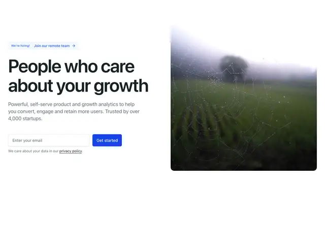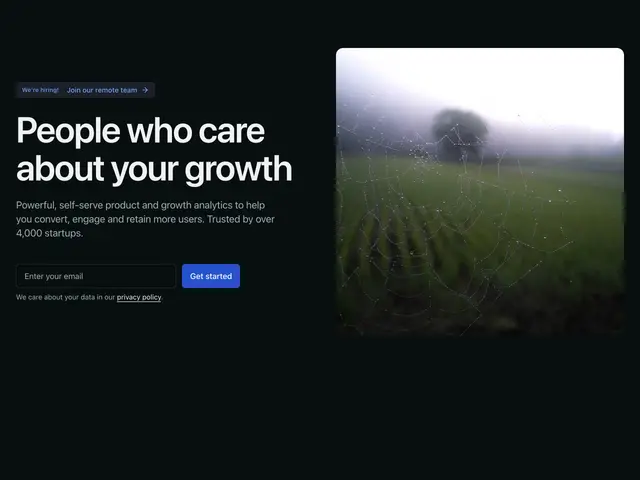
Split image 01A heading, line and email signup beside an abstract image.
](https://apogee.avaui.dev/docs/hero-sections/split-image-01)[
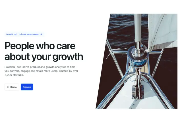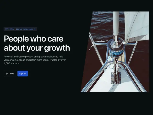
Split image 02A heading, line and two buttons beside a photo with a slanted edge.
](https://apogee.avaui.dev/docs/hero-sections/split-image-02)[
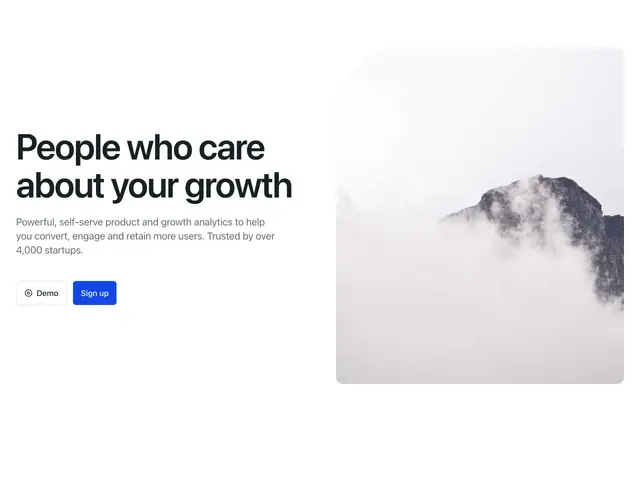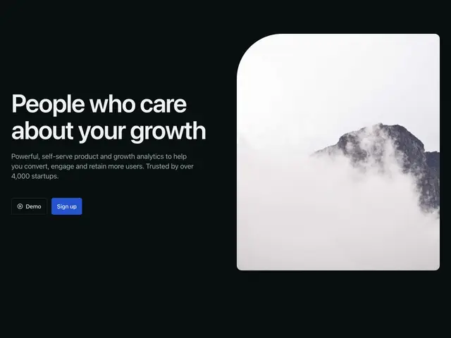
Split image 03A heading, line and two buttons beside a photo with one large rounded corner.
](https://apogee.avaui.dev/docs/hero-sections/split-image-03)[
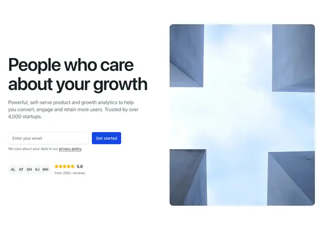
Split image 04A heading, line, email signup and rating beside a portrait photo.
](https://apogee.avaui.dev/docs/hero-sections/split-image-04)[
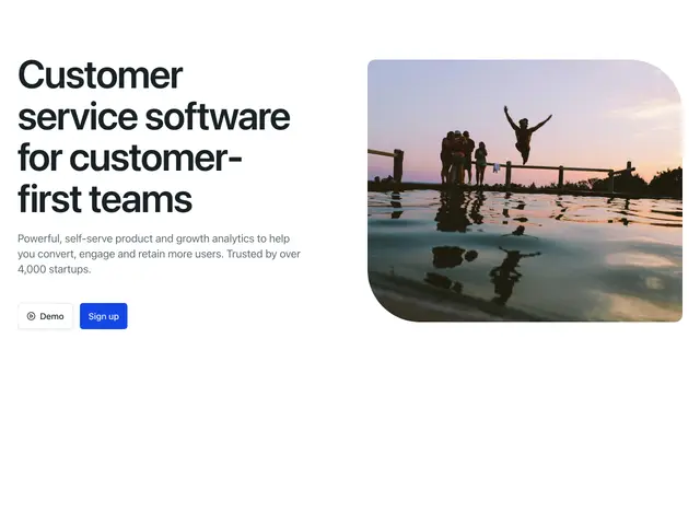
Split image 05A heading, line and two buttons beside a workspace photo, over a dot grid.
](https://apogee.avaui.dev/docs/hero-sections/split-image-05)[
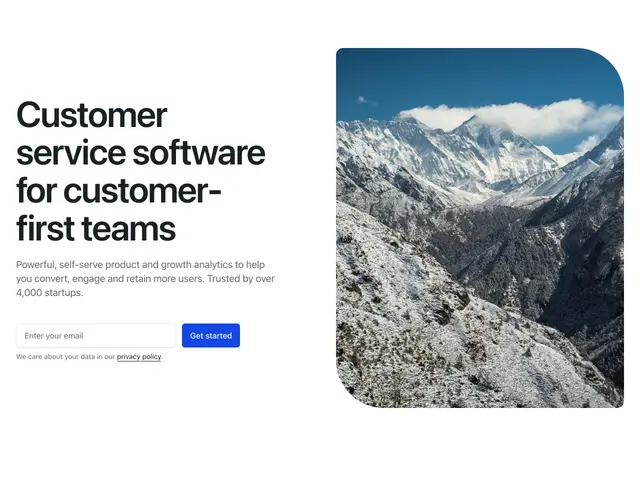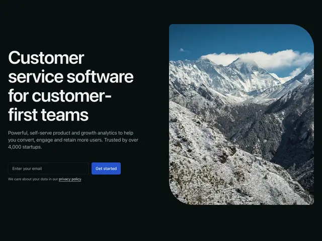
Split image 06A heading, line and email signup beside a portrait photo, over a dot grid.
](https://apogee.avaui.dev/docs/hero-sections/split-image-06)[
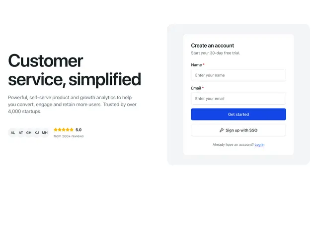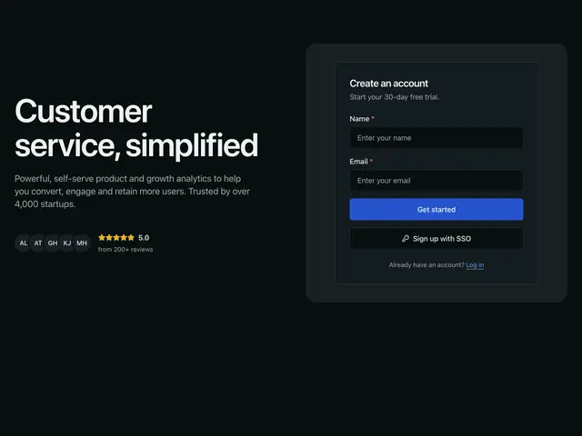
Split form 01A heading, line and rating beside a sign-up card.
](https://apogee.avaui.dev/docs/hero-sections/split-form-01)[
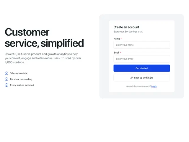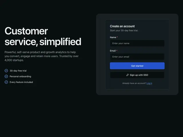
Split form 02A heading, line and three points beside a sign-up card.
](https://apogee.avaui.dev/docs/hero-sections/split-form-02)[
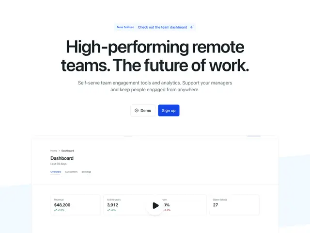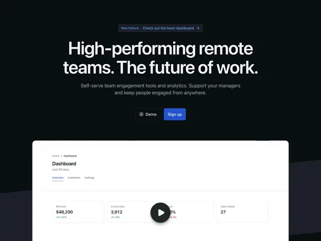
Abstract angles 01A centred heading and two buttons over a video on a slanted band.
](https://apogee.avaui.dev/docs/hero-sections/abstract-angles-01)[
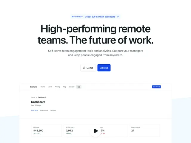
Abstract angles 02A centred heading and two buttons over a wide video on a slanted band.
](https://apogee.avaui.dev/docs/hero-sections/abstract-angles-02)[
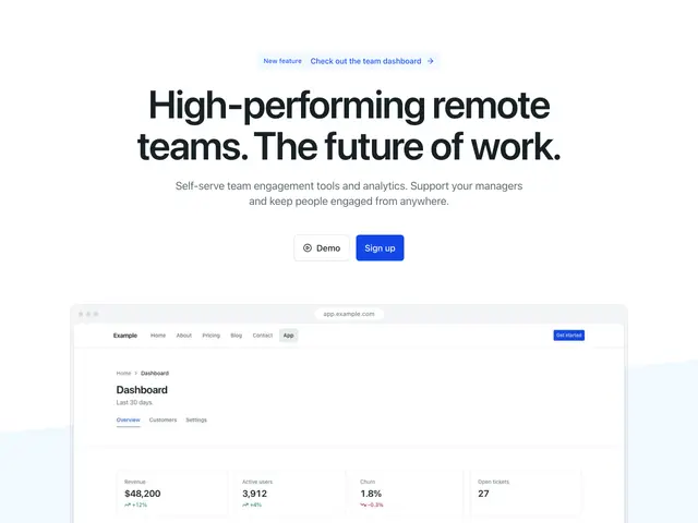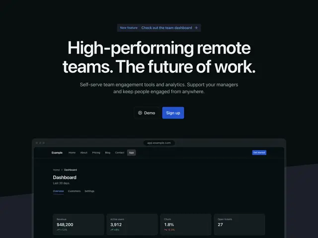
Abstract angles 03A centred heading and two buttons over a screenshot on a slanted band.
](https://apogee.avaui.dev/docs/hero-sections/abstract-angles-03)[
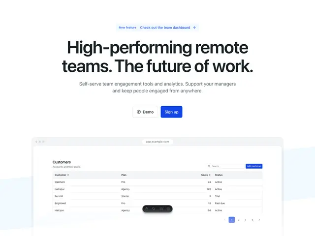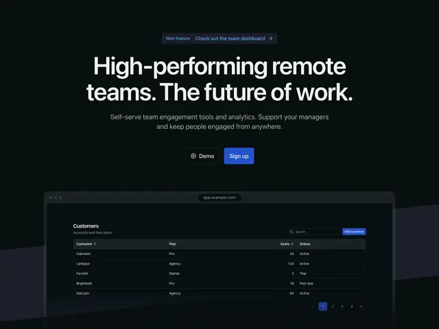
Abstract angles 04A centred heading and two buttons over a cropped screenshot on a slanted band.
](https://apogee.avaui.dev/docs/hero-sections/abstract-angles-04)[
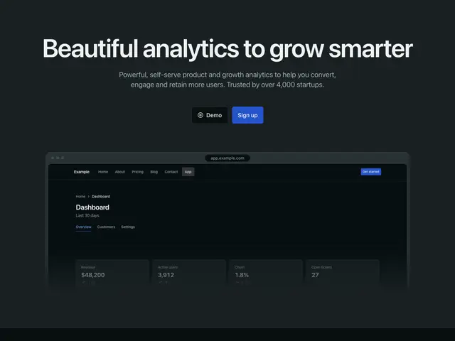
Screen mockup 01A centred heading and two buttons over a cropped screenshot, on a tint with a dot grid.
](https://apogee.avaui.dev/docs/hero-sections/screen-mockup-01)[
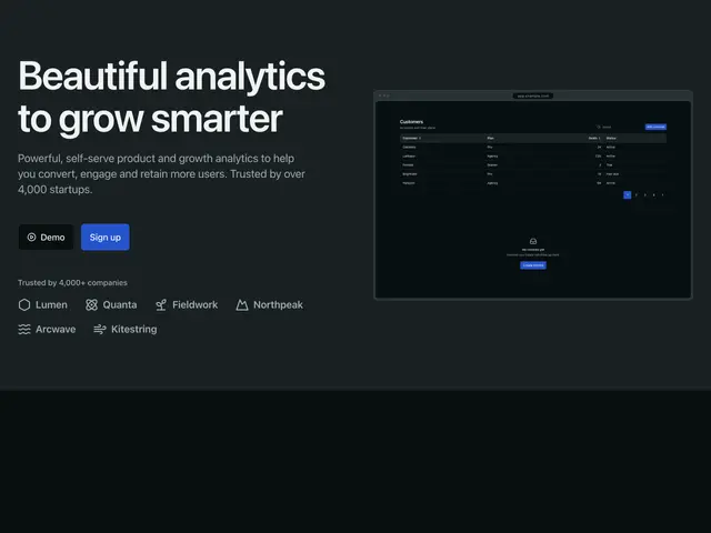
Screen mockup 02A heading, two buttons and customer logos beside a screenshot, on a tint with a dot grid.
](https://apogee.avaui.dev/docs/hero-sections/screen-mockup-02)[
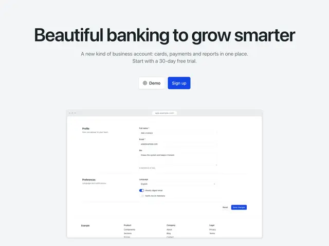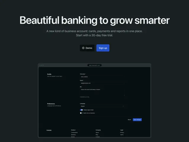
Screen mockup 03A centred heading and two buttons over a screenshot, on a tint with a dot grid.
](https://apogee.avaui.dev/docs/hero-sections/screen-mockup-03)[
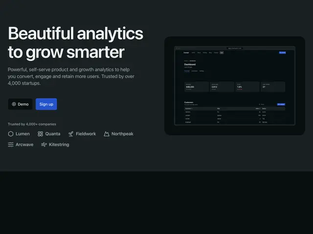
Screen mockup 04A heading, two buttons and customer logos beside a screenshot on a panel, on a tint with a dot grid.
](https://apogee.avaui.dev/docs/hero-sections/screen-mockup-04)[

Screen mockup 05A centred heading and two buttons over a phone on small screens and a browser on wide ones, over a grid.
](https://apogee.avaui.dev/docs/hero-sections/screen-mockup-05)[
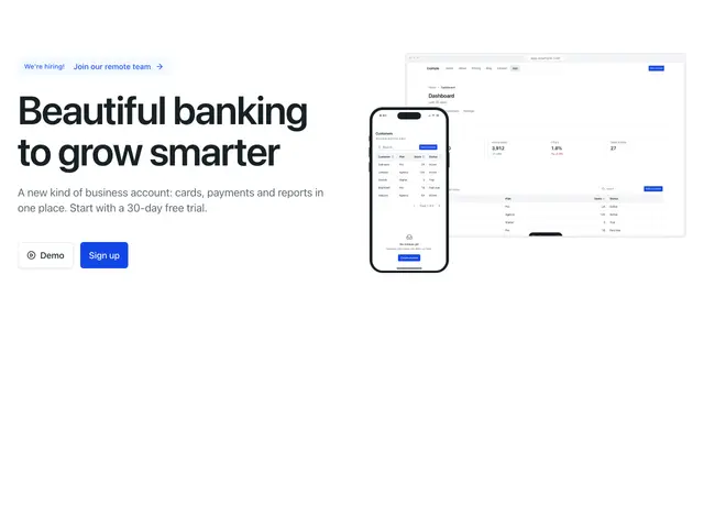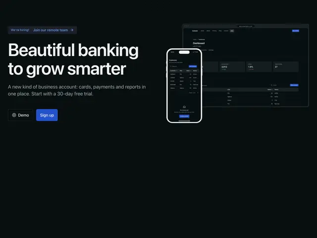
Screen mockup 06A heading and two buttons beside a screenshot with a phone in front, over a dot grid.
](https://apogee.avaui.dev/docs/hero-sections/screen-mockup-06)[

Screen mockup 07A centred heading and two buttons over a screenshot, over a fine grid.
](https://apogee.avaui.dev/docs/hero-sections/screen-mockup-07)[
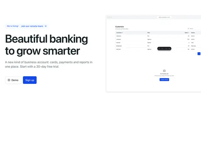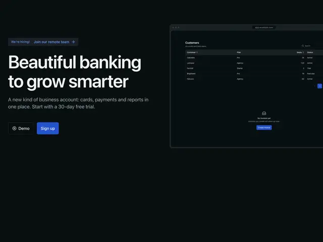
Screen mockup 08A heading and two buttons beside a large screenshot, over a dot grid.
](https://apogee.avaui.dev/docs/hero-sections/screen-mockup-08)[
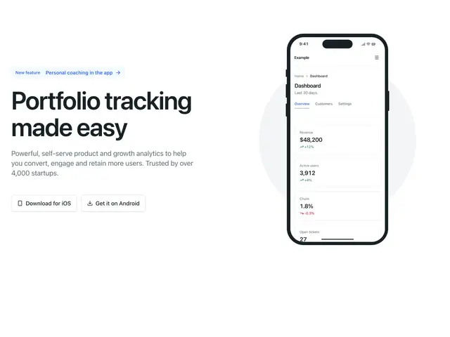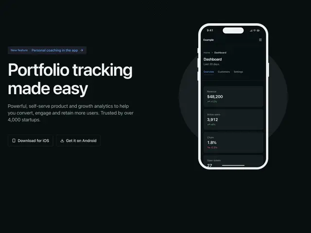
IPhone mockup 01A heading, line and app buttons beside a phone, over a dot grid.
](https://apogee.avaui.dev/docs/hero-sections/iphone-mockup-01)[
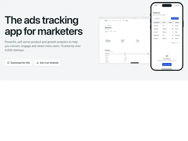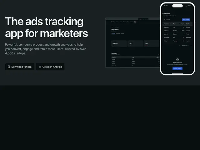
IPhone mockup 02A heading, line and app buttons beside a phone over a screenshot, on a tint with a dot grid.
](https://apogee.avaui.dev/docs/hero-sections/iphone-mockup-02)[
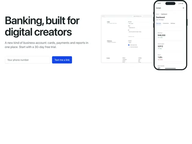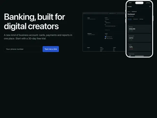
IPhone mockup 03A heading, line and a text-me-a-link form beside a phone over a screenshot, over a dot grid.
](https://apogee.avaui.dev/docs/hero-sections/iphone-mockup-03)[
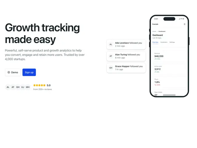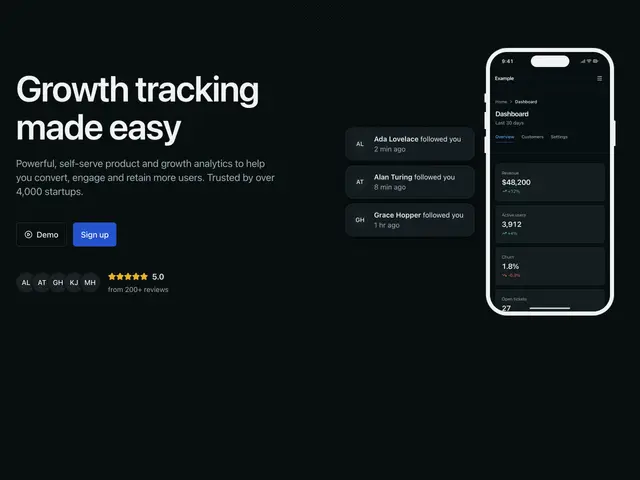
IPhone mockup 04A heading, two buttons and a rating beside a phone, with notifications beside it.
](https://apogee.avaui.dev/docs/hero-sections/iphone-mockup-04)[
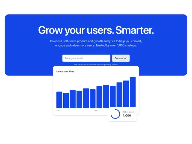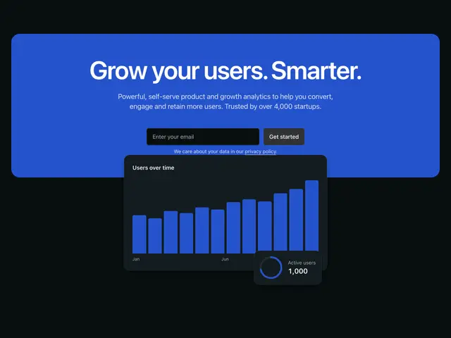
Color card 01A centred heading and email signup on a brand card, over a chart.
](https://apogee.avaui.dev/docs/hero-sections/color-card-01)[
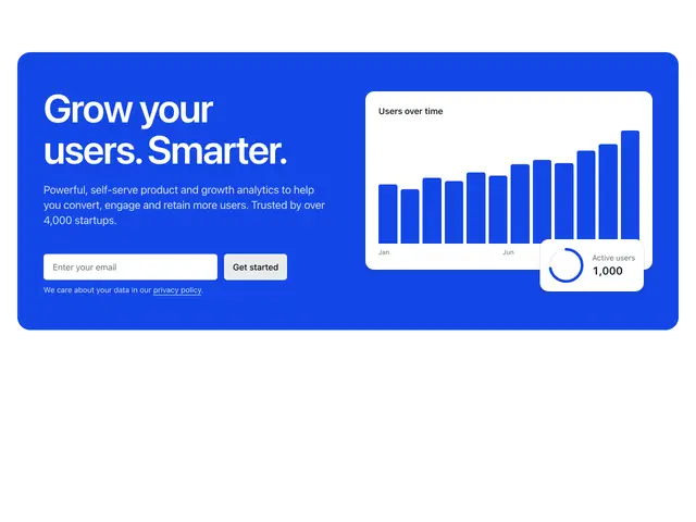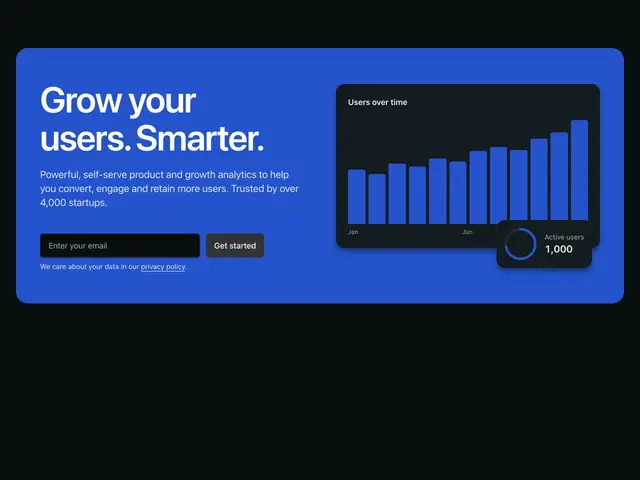
Color card 02A heading and email signup beside a chart, on a brand card.
](https://apogee.avaui.dev/docs/hero-sections/color-card-02)[

Color card 03A centred heading and email signup on a brand card, over a screenshot that overlaps it.
](https://apogee.avaui.dev/docs/hero-sections/color-card-03)[
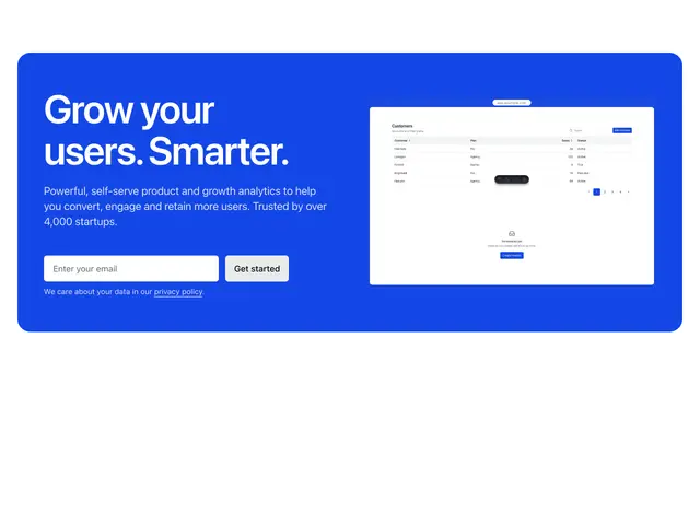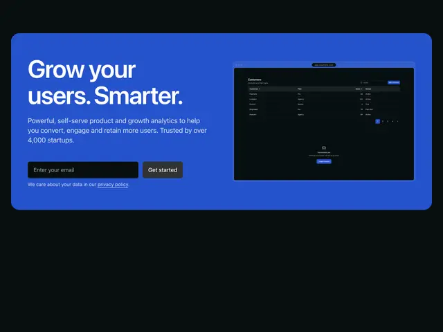
Color card 04A heading and email signup beside a screenshot, on a brand card.
](https://apogee.avaui.dev/docs/hero-sections/color-card-04)[
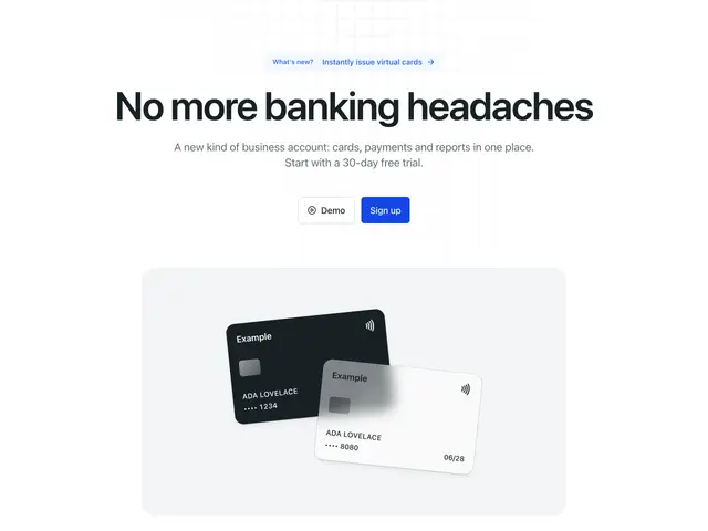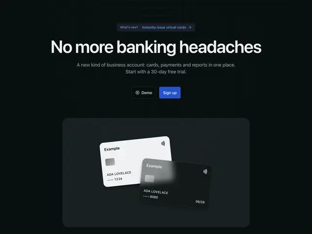
Card mockup 01A centred heading and two buttons over two payment cards on a panel, over a fine grid.
](https://apogee.avaui.dev/docs/hero-sections/card-mockup-01)[
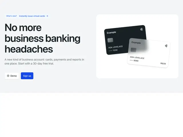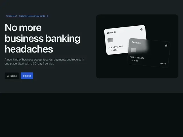
Card mockup 02A heading and two buttons beside two payment cards on a panel, on a tint with a dot grid.
](https://apogee.avaui.dev/docs/hero-sections/card-mockup-02)[
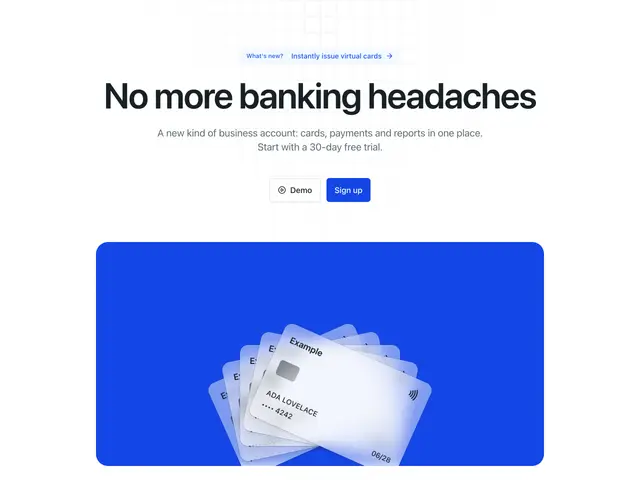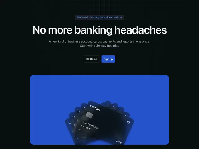
Card mockup 03A centred heading and two buttons over five payment cards fanned on a brand panel, over a fine grid.
](https://apogee.avaui.dev/docs/hero-sections/card-mockup-03)[
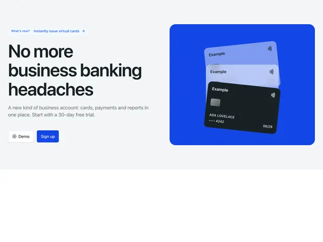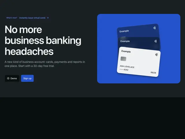
Card mockup 04A heading and two buttons beside three stacked payment cards on a brand panel.
](https://apogee.avaui.dev/docs/hero-sections/card-mockup-04)[
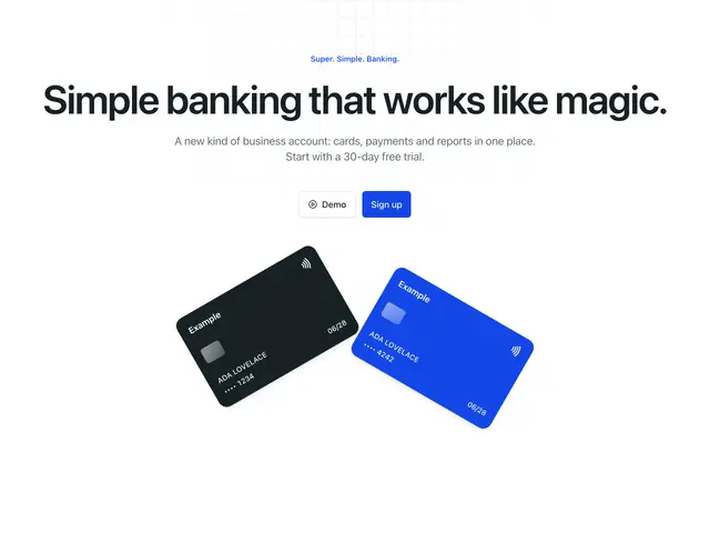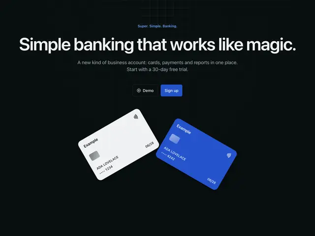
Card mockup 05A centred eyebrow, heading and two buttons over two tilted payment cards, over a fine grid.
](https://apogee.avaui.dev/docs/hero-sections/card-mockup-05)[
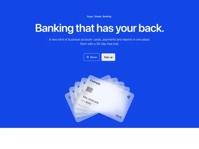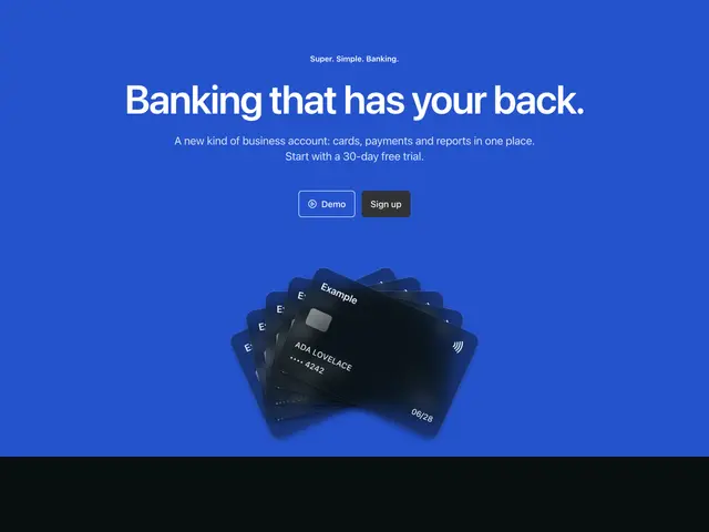
Card mockup 06A centred eyebrow, heading and two buttons over five fanned payment cards, on the brand colour.
](https://apogee.avaui.dev/docs/hero-sections/card-mockup-06)[
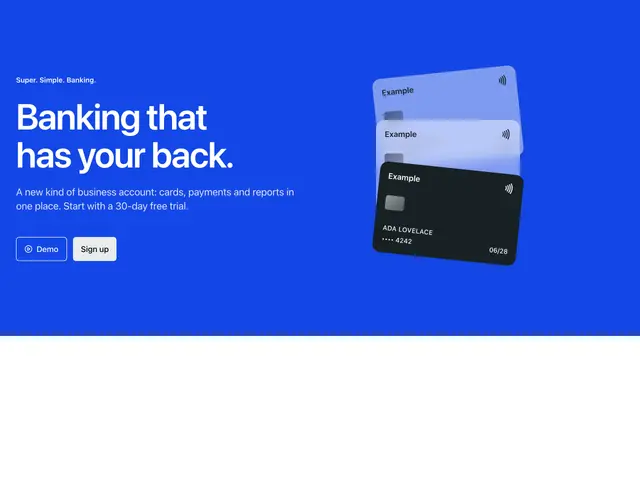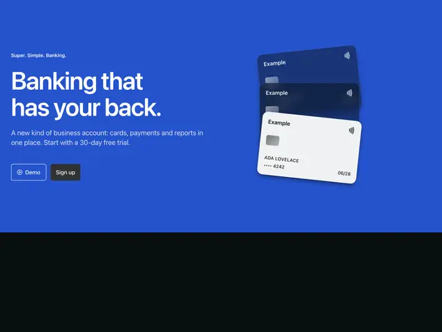
Card mockup 07An eyebrow, heading and two buttons beside three stacked payment cards, on the brand colour.
](https://apogee.avaui.dev/docs/hero-sections/card-mockup-07)[
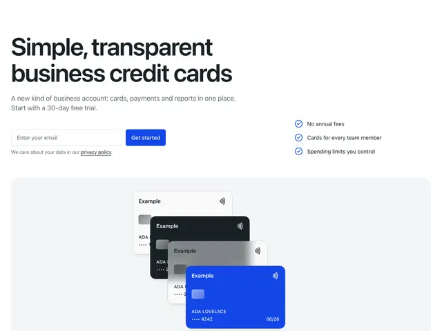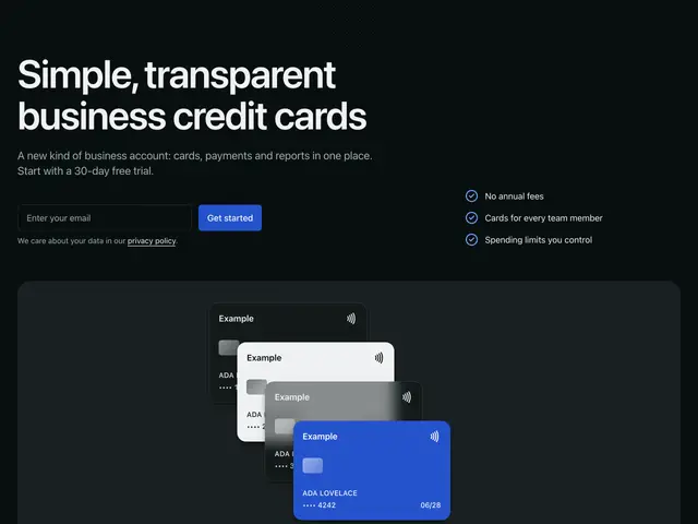
Card mockup 08A heading, email signup and three points over a wide panel of payment cards, over a dot grid.
](https://apogee.avaui.dev/docs/hero-sections/card-mockup-08)[
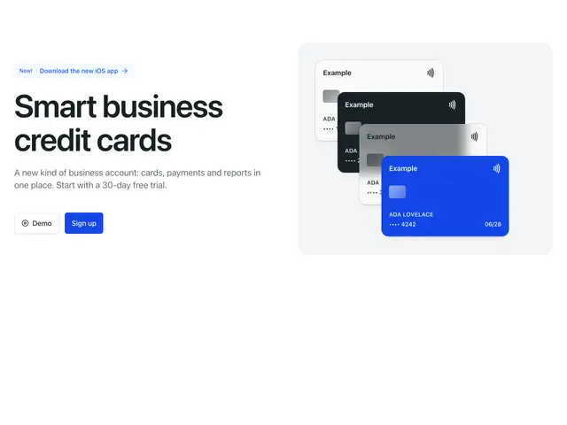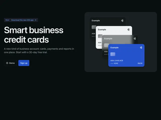
Card mockup 09A heading and two buttons beside four payment cards on a panel.
](https://apogee.avaui.dev/docs/hero-sections/card-mockup-09)[
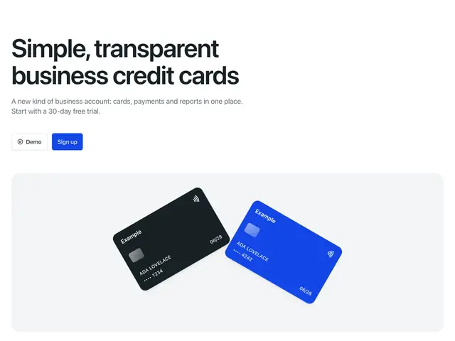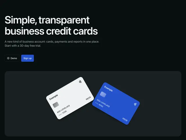
Card mockup 10A heading and two buttons over a wide panel of tilted payment cards.
](https://apogee.avaui.dev/docs/hero-sections/card-mockup-10)[
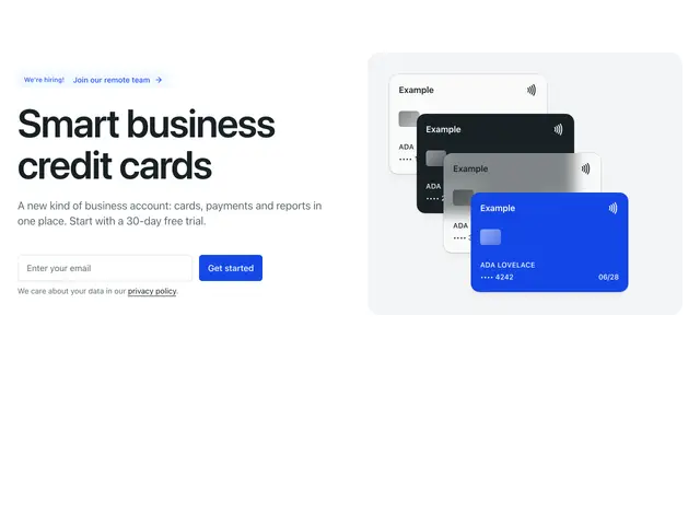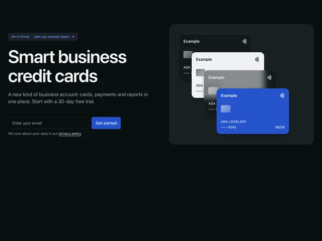
Card mockup 11A heading and email signup beside a cascade of payment cards on a panel.
](https://apogee.avaui.dev/docs/hero-sections/card-mockup-11)[
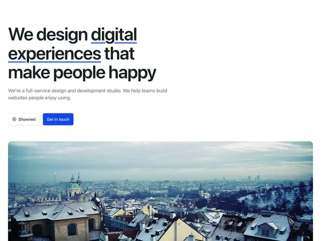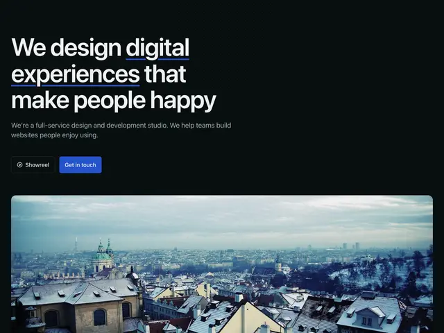
Simple text 01A large heading with an underlined phrase, a line and two buttons over a wide photo, over a dot grid.
](https://apogee.avaui.dev/docs/hero-sections/simple-text-01)[
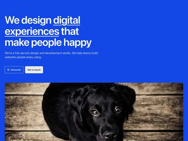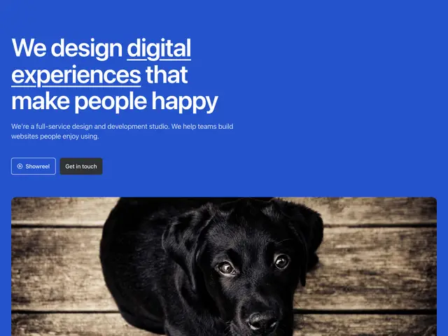
Simple text 02A large heading with an underlined phrase, a line and two buttons over a wide photo, on the brand colour.
](https://apogee.avaui.dev/docs/hero-sections/simple-text-02)[
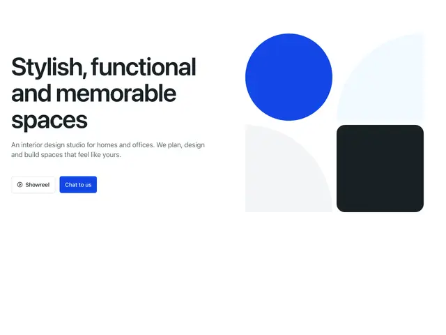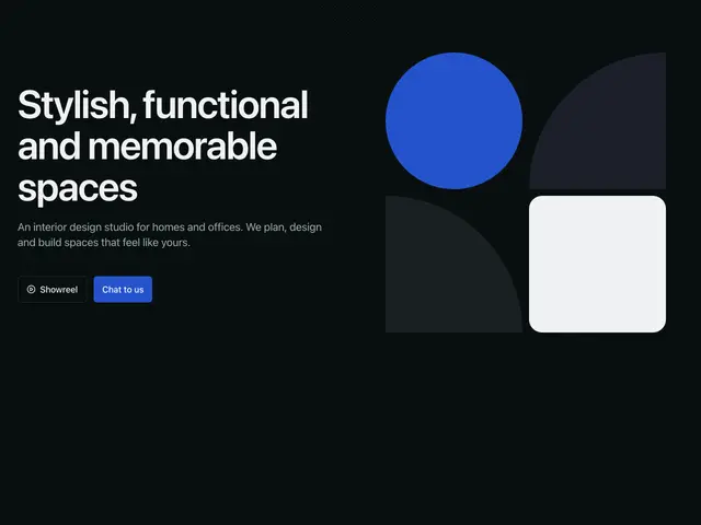
Geometric shapes 01A heading, line and two buttons beside a block of geometric shapes, over a dot grid.
](https://apogee.avaui.dev/docs/hero-sections/geometric-shapes-01)[
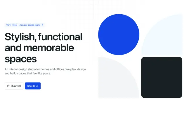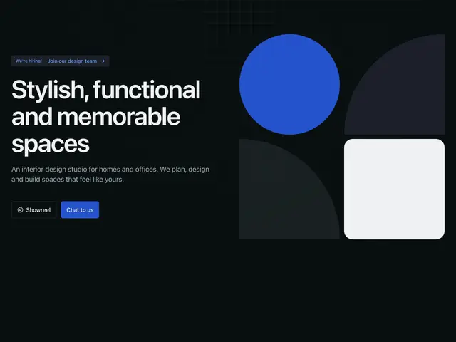
Geometric shapes 02A heading, line and two buttons beside geometric shapes that fill the right half, over a grid.
](https://apogee.avaui.dev/docs/hero-sections/geometric-shapes-02)[
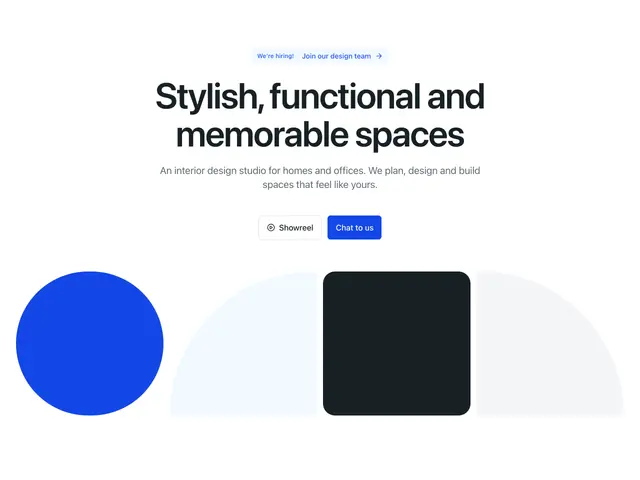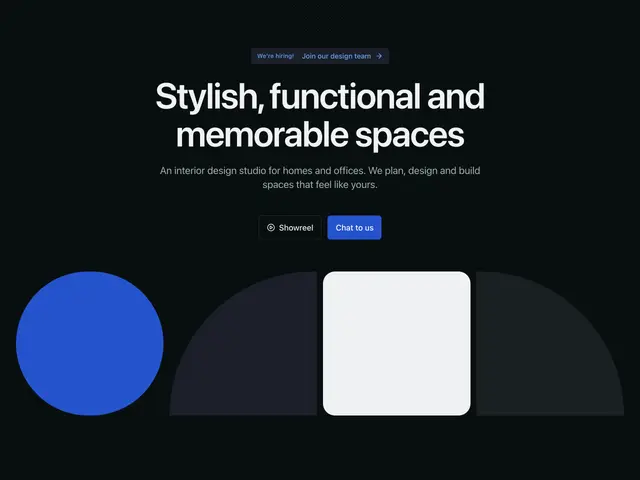
Geometric shapes 03A centred heading, line and two buttons over a wide row of geometric shapes, over a dot grid.
](https://apogee.avaui.dev/docs/hero-sections/geometric-shapes-03)[
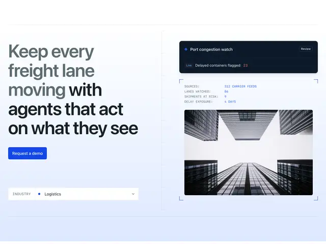
Framed split 01A two-tone heading, a button and an industry picker beside a live status card and a bracketed image, inside a ruled frame on a primary tint.
](https://apogee.avaui.dev/docs/hero-sections/framed-split-01)[
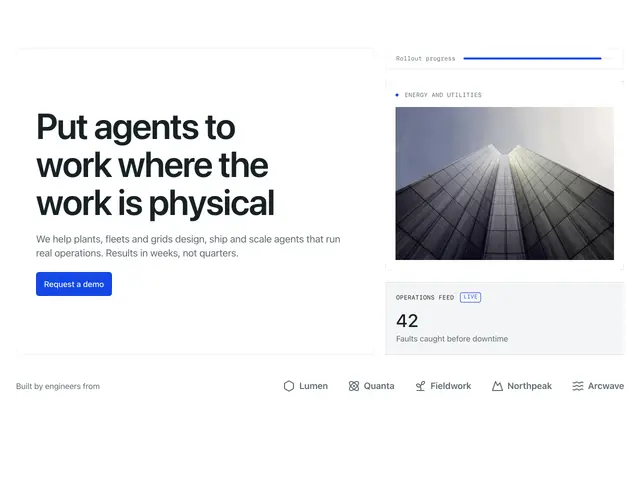
Framed panels 01A heading, line and button in a ruled panel beside a progress strip, a bracketed image and a live stat, over a row of logos.
](https://apogee.avaui.dev/docs/hero-sections/framed-panels-01)[
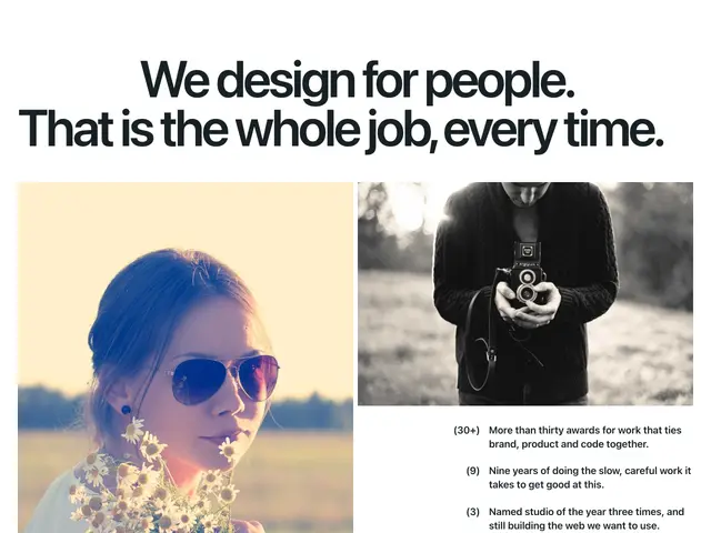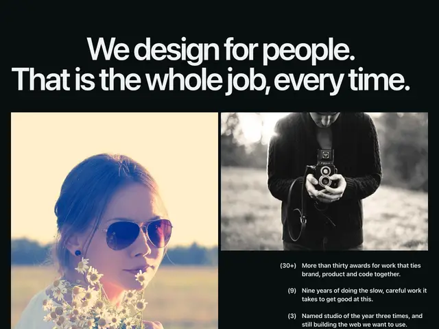
Editorial images 01A very large heading with an indented first line over a tall photo and a wide photo, with numbered facts under the wide one.
](https://apogee.avaui.dev/docs/hero-sections/editorial-images-01)[
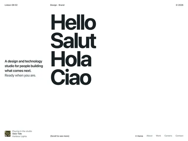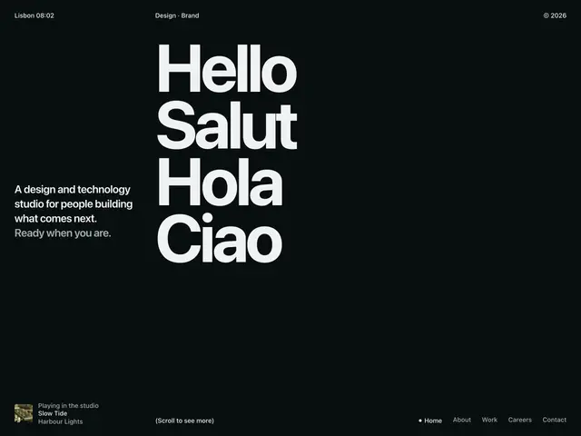
Greeting plus 01A full-screen grid with corner labels, an outlined plus sign, stacked greetings in four languages, a short statement and a footer row with a now-playing note.
](https://apogee.avaui.dev/docs/hero-sections/greeting-plus-01)[
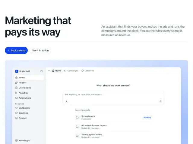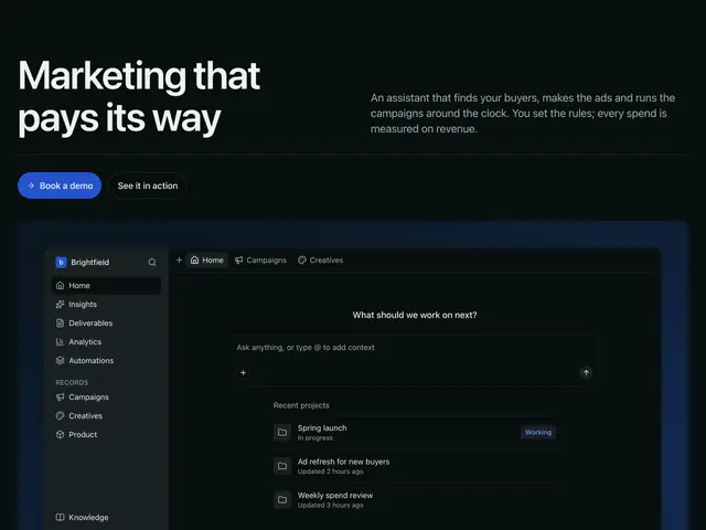
App panel 01A serif heading beside a short line, two round buttons, then an app mockup with a sidebar, prompt box and recent projects on a soft primary panel, over a row of logos.
](https://apogee.avaui.dev/docs/hero-sections/app-panel-01)[
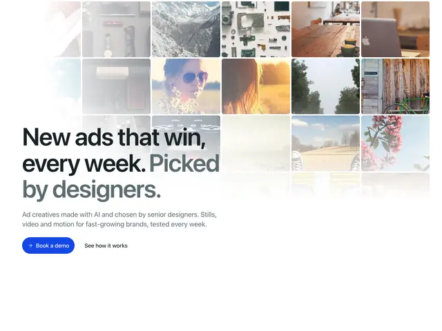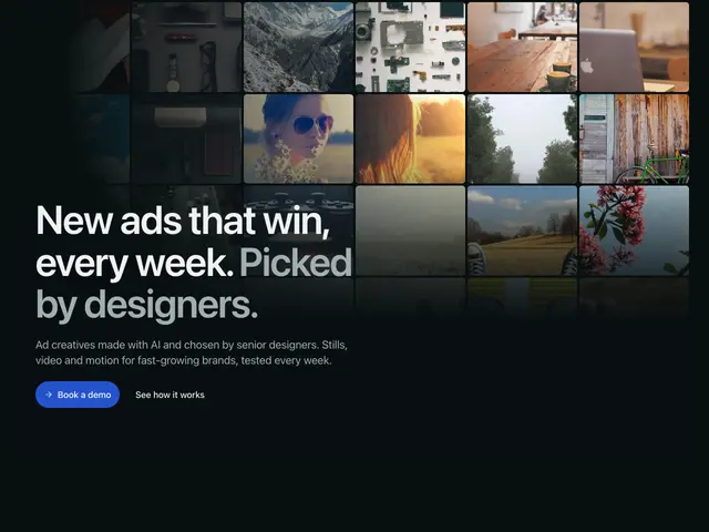
Card field 01A field of small image cards that grow toward the top corner and fade away from it, with a two-tone serif heading, line and two buttons in the opposite corner.
](https://apogee.avaui.dev/docs/hero-sections/card-field-01)[
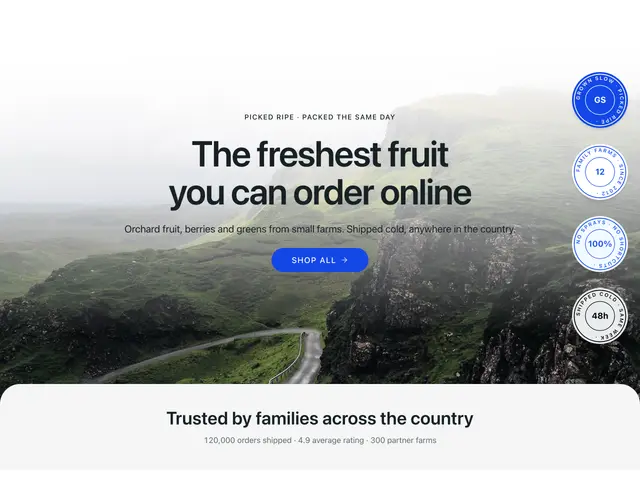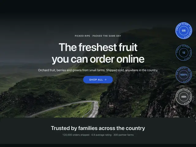
Photo stamps 01A full-width photo with a centred eyebrow, heading, line and round button, a column of round stamps down one side and a rounded panel rising over the bottom edge.
](https://apogee.avaui.dev/docs/hero-sections/photo-stamps-01)[
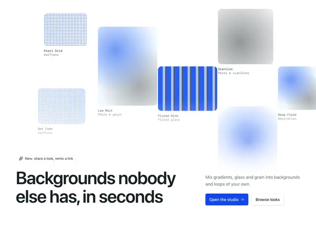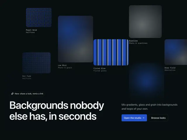
Swatch scatter 01Pattern swatches with mono captions scattered across the section, a pill, a large heading at the bottom start and a line with two buttons at the bottom end.
](https://apogee.avaui.dev/docs/hero-sections/swatch-scatter-01)[
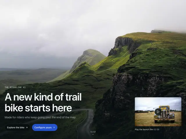
Product photo 01A full-screen product photo with a mono eyebrow, heading, line and two round buttons at the bottom start, a scroll cue in the middle and a video thumbnail at the bottom end.
](https://apogee.avaui.dev/docs/hero-sections/product-photo-01)[
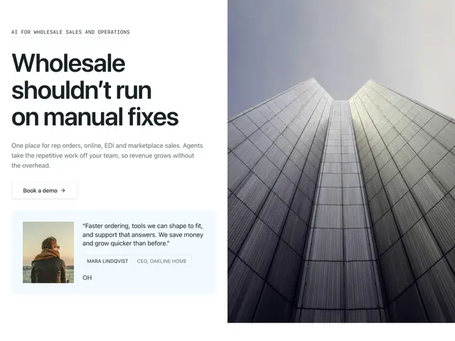
Brand panel 01A mono eyebrow, heading, line, button and a testimonial card beside a full-height dark panel with a glowing mark and wordmark.
](https://apogee.avaui.dev/docs/hero-sections/brand-panel-01)[
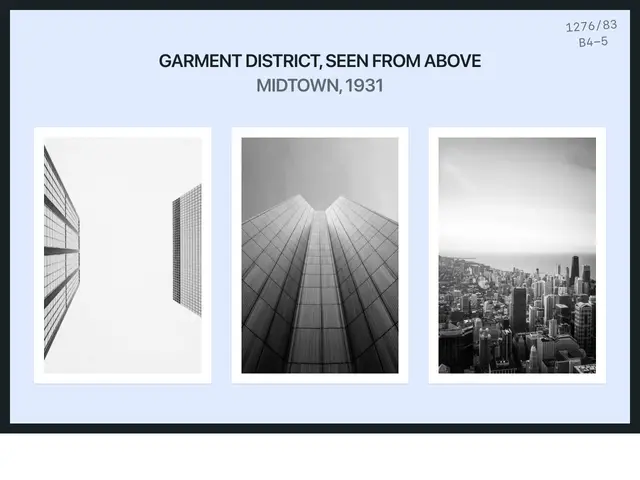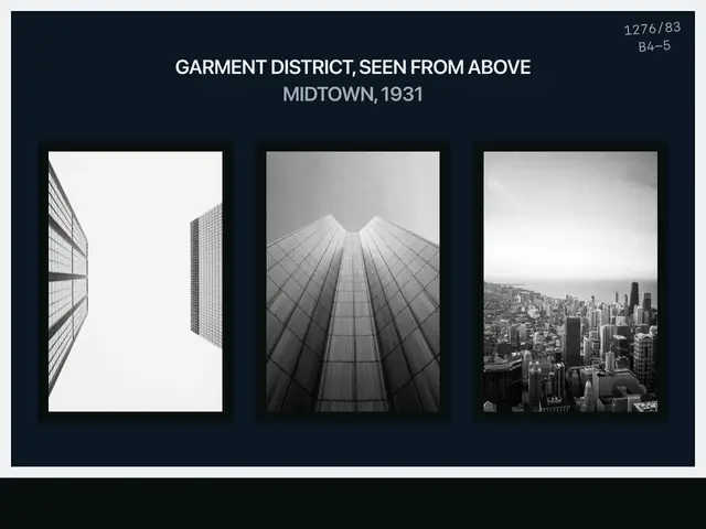
Archive board 01A framed archive card with a spaced title, a catalogue number and three mounted black-and-white photos, one turned on its side.
](https://apogee.avaui.dev/docs/hero-sections/archive-board-01)[
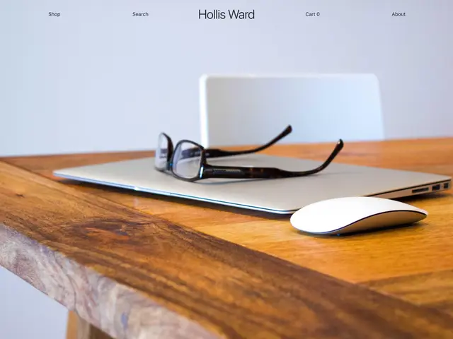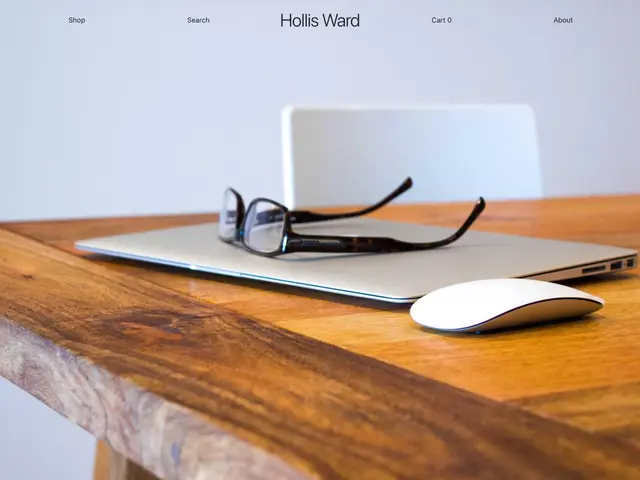
Photo wordmark 01A full-screen still-life photo with a quiet five-column bar on top: two links, a centred wordmark, two links.
](https://apogee.avaui.dev/docs/hero-sections/photo-wordmark-01)[
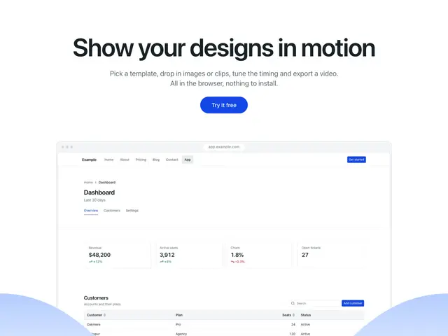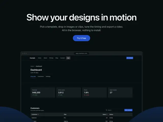
Screen hills 01A centred heading, line and round button over an app screenshot that sits between two rolling hills.
](https://apogee.avaui.dev/docs/hero-sections/screen-hills-01)[
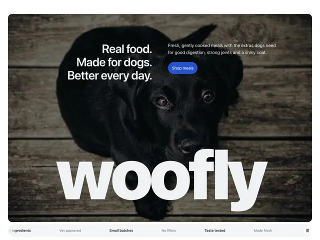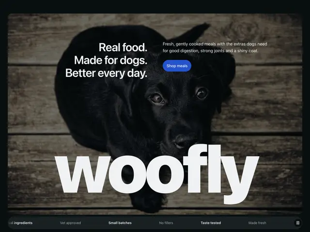
Wordmark photo 01A rounded photo card with a stacked heading, a line and a round button, a giant wordmark across the bottom and a scrolling strip of claims under it.
](https://apogee.avaui.dev/docs/hero-sections/wordmark-photo-01)[
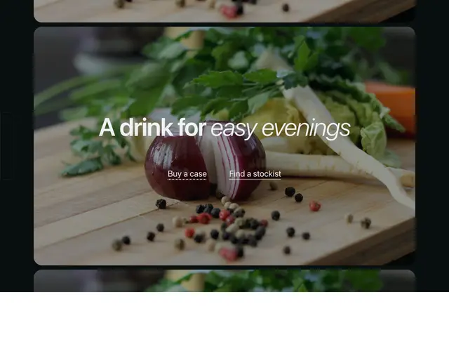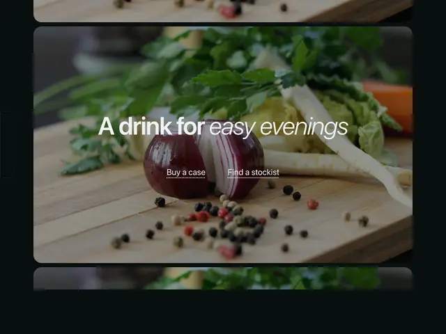
Film strip 01A photo framed like a frame of cine film, with the next frames peeking in above and below, a centred two-part heading and two dotted links.
](https://apogee.avaui.dev/docs/hero-sections/film-strip-01)[
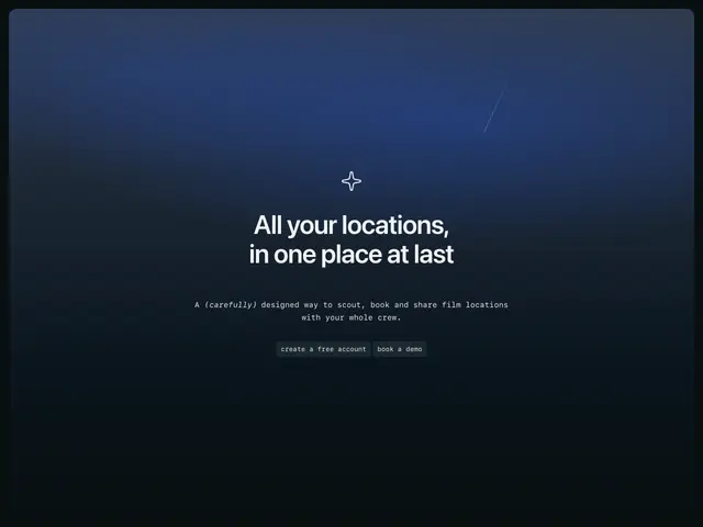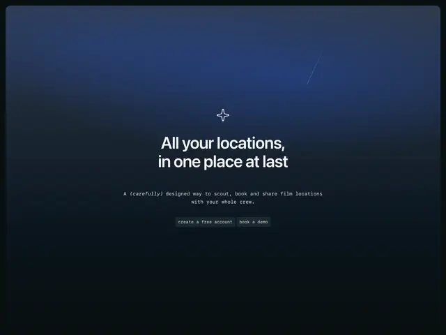
Dusk card 01A rounded card painted like a dim evening sky, with a small mark, a centred heading, a mono line and two small mono buttons.
](https://apogee.avaui.dev/docs/hero-sections/dusk-card-01)[

Halftone glow 01A centred heading, line and two round buttons on a band that runs from dark through the primary hue into the page, with a halftone dot texture and a logo strip below.
](https://apogee.avaui.dev/docs/hero-sections/halftone-glow-01)[
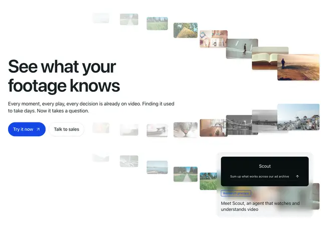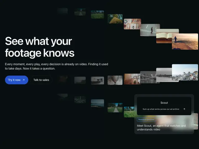
Thumb streams 01Streams of small video thumbnails that curve across the section and grow toward the end, with a heading, line and two buttons at the start and a preview card in the corner.
](https://apogee.avaui.dev/docs/hero-sections/thumb-streams-01)[
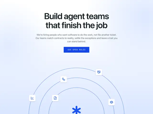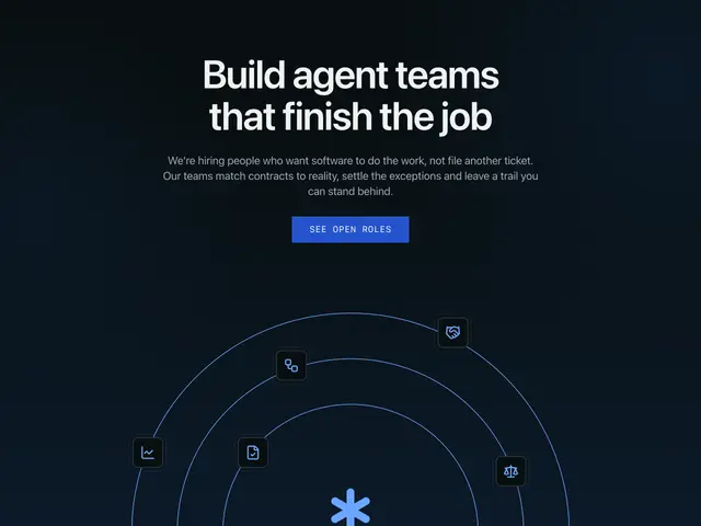
Orbit arcs 01A centred heading, line and square button on a soft primary wash, over three half-circle arcs with team photos sitting on them and a mark at the centre.
](https://apogee.avaui.dev/docs/hero-sections/orbit-arcs-01)[

Audit cards 01A centred eyebrow, heading, line and square button on a soft wash, over a composite of product cards: a summary, insights with tags and a validation table with pass and fail rows.
](https://apogee.avaui.dev/docs/hero-sections/audit-cards-01)[
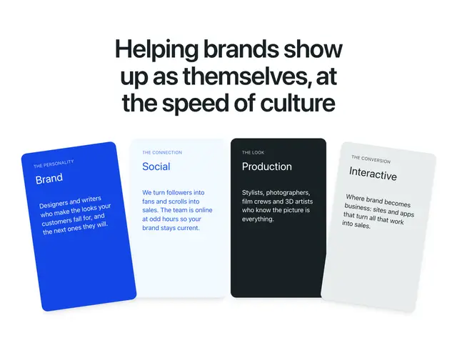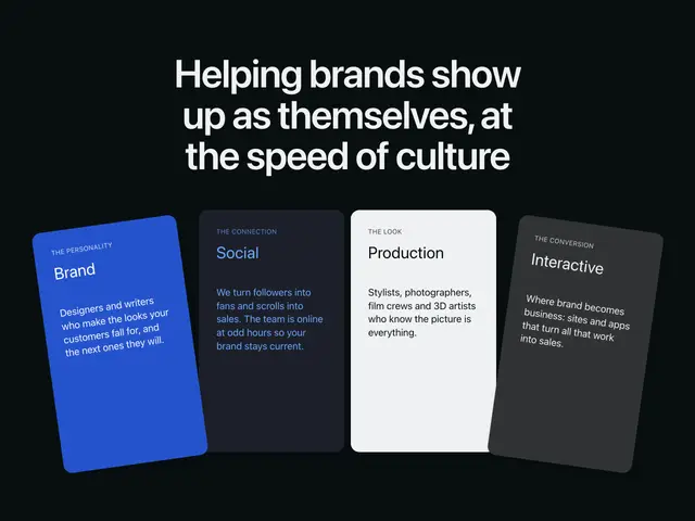
Fanned cards 01A centred heading over four service cards fanned out like a hand, each in a different brand fill, with a progress line under them; a swipe row on phones.
](https://apogee.avaui.dev/docs/hero-sections/fanned-cards-01)[
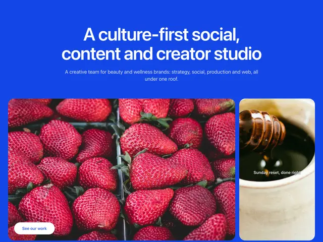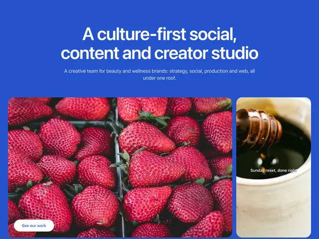
Brand photos 01A centred heading and line on the brand surface, over a wide photo with a round button and a tall photo with a caption.
](https://apogee.avaui.dev/docs/hero-sections/brand-photos-01)[
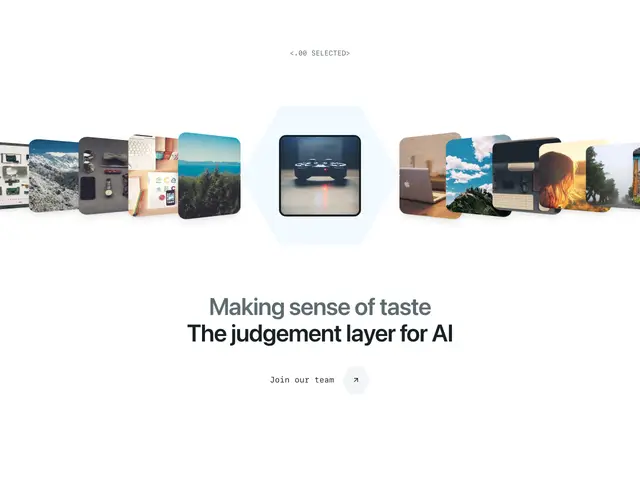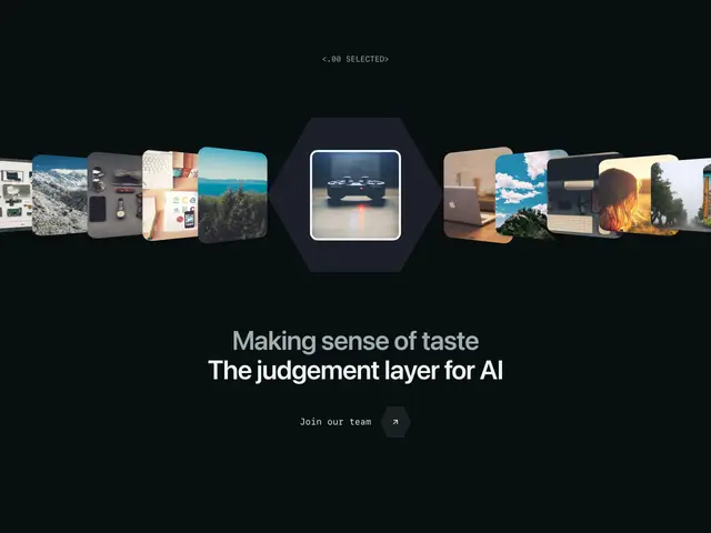
Coverflow 01A row of cards turned toward a centre card in a hexagon frame, with a mono label above, a two-tone heading below and a link with a hexagon arrow.
](https://apogee.avaui.dev/docs/hero-sections/coverflow-01)[
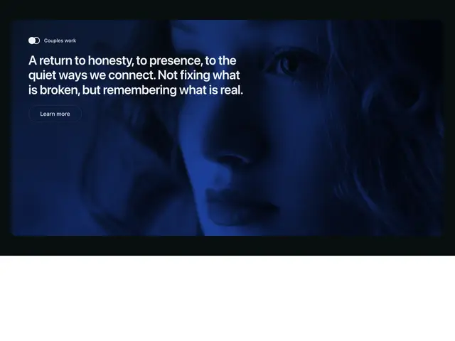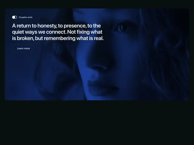
Tinted photo 01A rounded photo card washed in the primary hue, with a small mark and label, a statement heading and an outline round button at the top start.
](https://apogee.avaui.dev/docs/hero-sections/tinted-photo-01)[
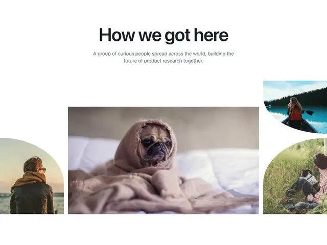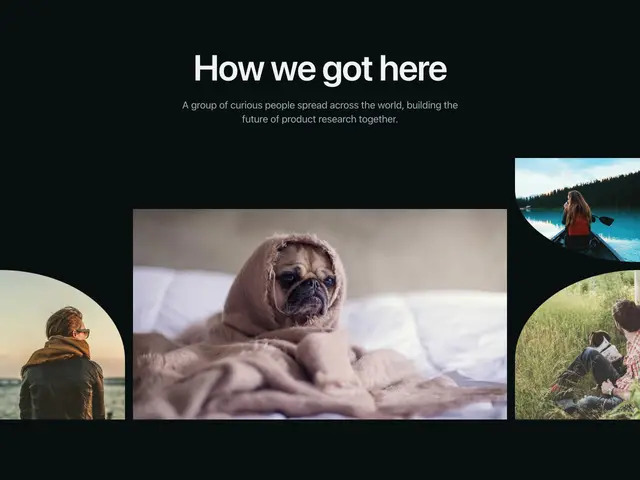
Curved gallery 01A centred heading and line over a row of team photos; the middle one is framed, and the side ones bleed off the edges inside large curves.
](https://apogee.avaui.dev/docs/hero-sections/curved-gallery-01)[
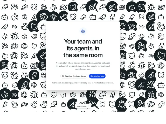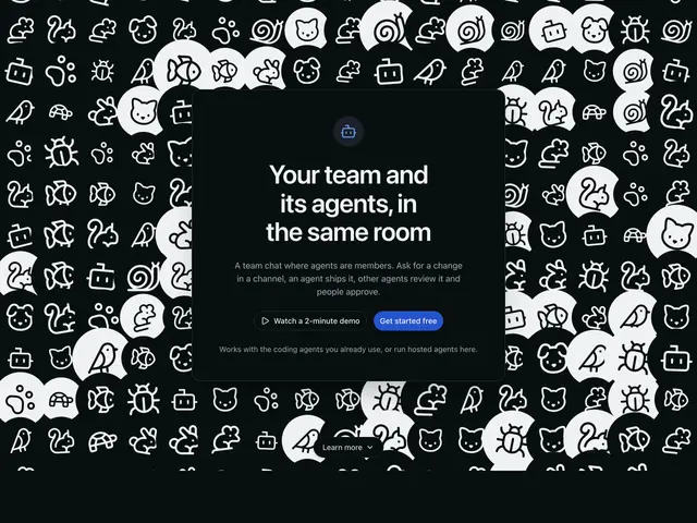
Icon crowd 01A dense wall of animal and robot icons fills the section, with a raised card in the middle holding a mark, heading, line, two buttons and a note, and a pill at the bottom.
](https://apogee.avaui.dev/docs/hero-sections/icon-crowd-01)[
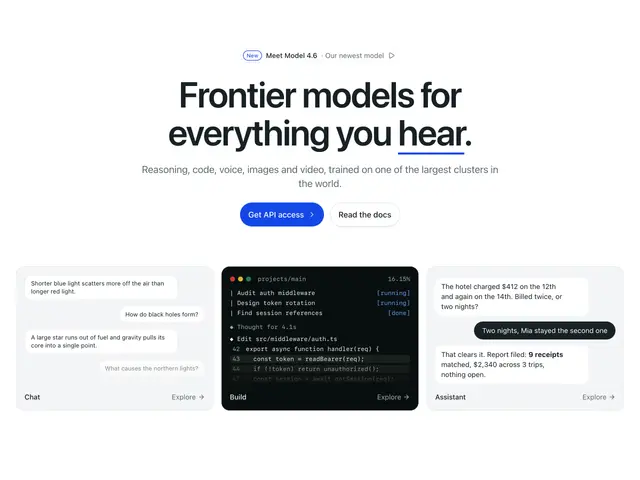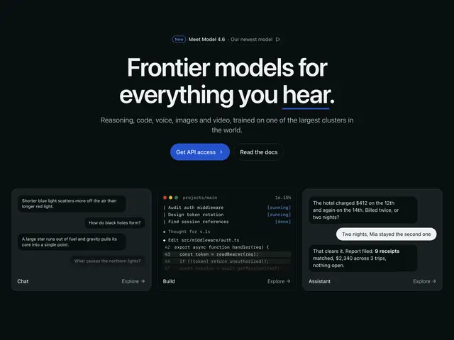
Product tiles 01A news pill, a centred heading with an underlined last word, a line and two buttons, over three product tiles: a chat, a coding terminal and an assistant thread.
](https://apogee.avaui.dev/docs/hero-sections/product-tiles-01)[
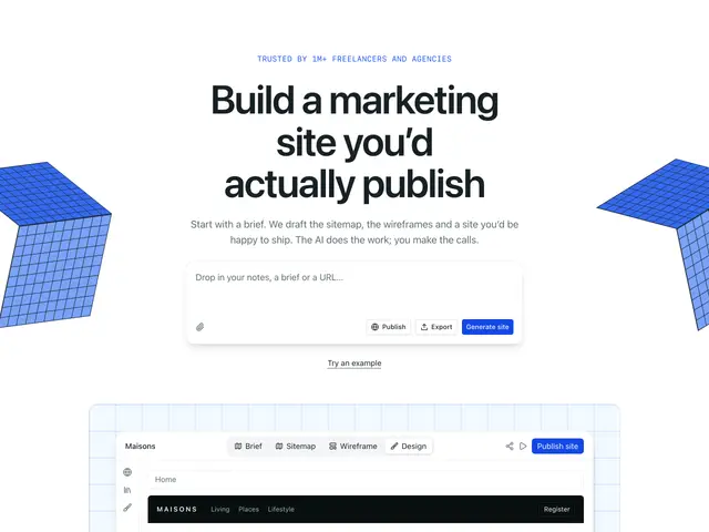
Prompt cubes 01A mono eyebrow, centred heading and line over a prompt box with actions, flanked by two gridded cubes, above an app window on a gridded panel.
](https://apogee.avaui.dev/docs/hero-sections/prompt-cubes-01)[
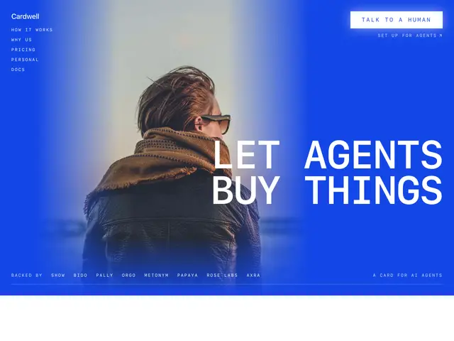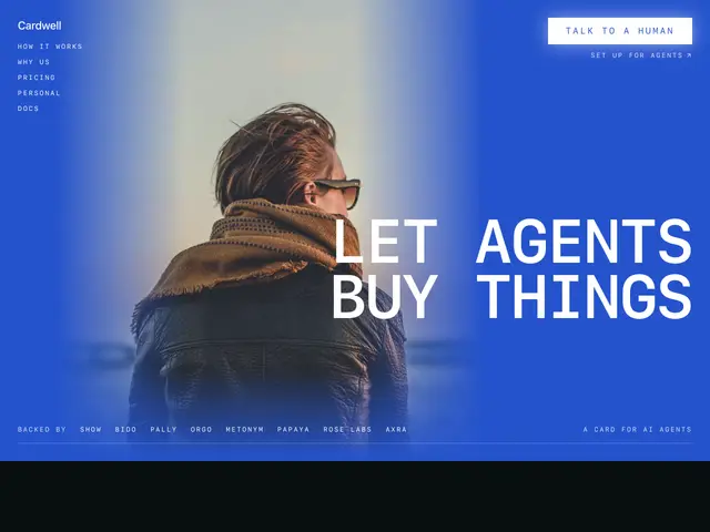
Brand statement 01A photo of a person on the brand colour, a stacked mono menu at the top start, a lit button at the top end and a huge uppercase mono statement at the bottom end, over a row of backers.
](https://apogee.avaui.dev/docs/hero-sections/brand-statement-01)[
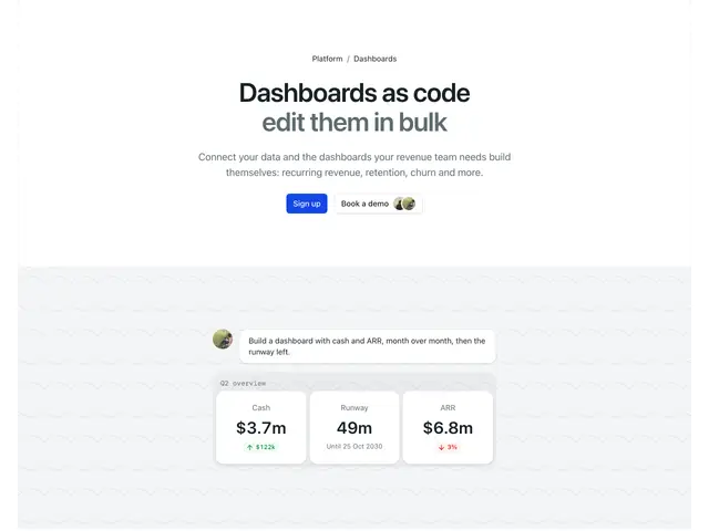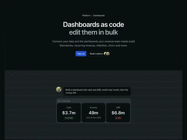
Dashboard prompt 01A breadcrumb, a two-tone heading, a line and two buttons in a dashed frame, over a patterned panel where a prompt turns into three stat cards.
](https://apogee.avaui.dev/docs/hero-sections/dashboard-prompt-01)[
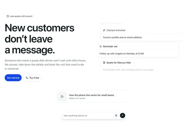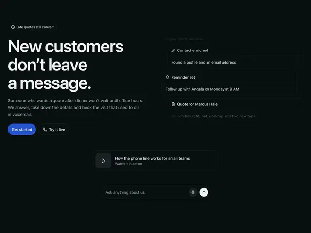
Activity stack 01A pill, heading, line and two buttons beside a fading stack of activity cards, over a video card and an ask-anything bar.
](https://apogee.avaui.dev/docs/hero-sections/activity-stack-01)[
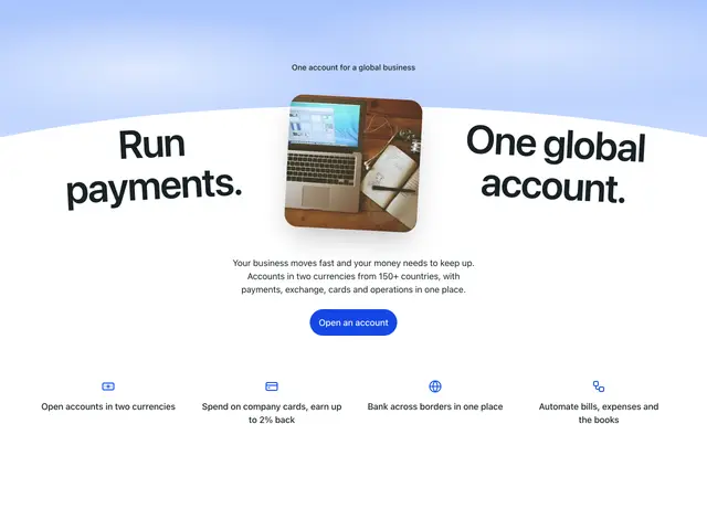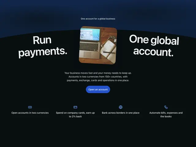
Arc headline 01A sky band cut by a wide curve, a product photo in the middle with two halves of the heading tilted along the curve beside it, a line, a round button and four feature columns.
](https://apogee.avaui.dev/docs/hero-sections/arc-headline-01)[

Gifting tabs 01A huge heading with an italic second line, a line and an email signup between two tilted product photos on soft blooms, over a row of feature tabs with a title and pager.
](https://apogee.avaui.dev/docs/hero-sections/gifting-tabs-01)[
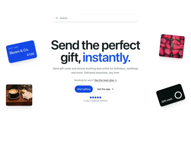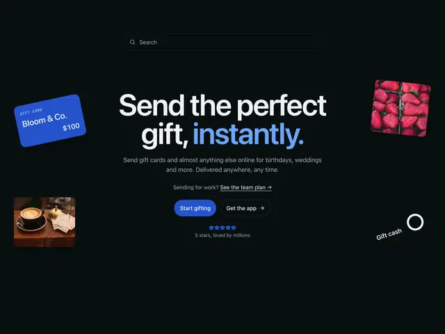
Floating gifts 01A search bar over a huge three-line heading with the last line in the brand colour, a line, two buttons and a rating, with four labelled gift items floating in the corners.
](https://apogee.avaui.dev/docs/hero-sections/floating-gifts-01)
## Related
[
SectionA full-width band with vertical rhythm and an optional Container, used to lay out page content.
](https://apogee.avaui.dev/docs/section)[
HeadingA semantic, fluid-sized heading — pick the tag with \`as\`, the visual size with \`size\`.
](https://apogee.avaui.dev/docs/heading)[
ButtonTriggers an action. Renders a