Foundations
The decisions every component is built on. Read these once; the components then explain themselves.
Last updated
Tokens, colour, type, spacing and motion are generated and checked, so a theme is a token override and never a component rewrite. Accessibility, RTL and content rules apply to every component the same way.
Design tokensFive hues times seven roles, generated from three numbers per hue; plus the static scales for radius, type, motion and spacing.
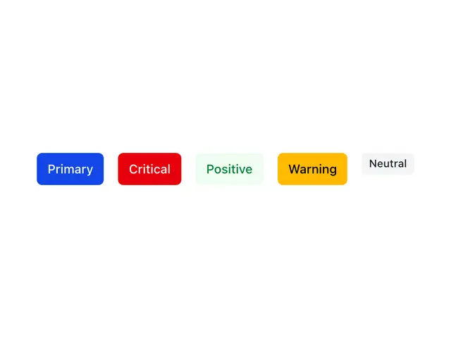
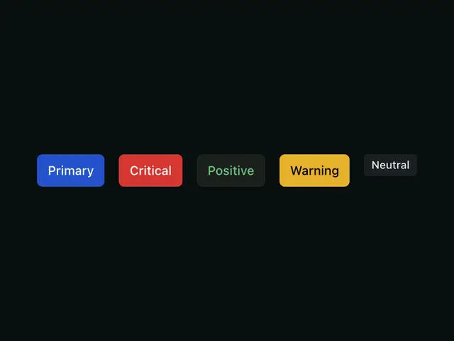
ColorHow the five hues become a full light and dark palette, and the contrast gate that keeps every pair readable.
Dark modeHow the page and any subtree pick light or dark, the before-paint script, the toggle helper, and what to watch in dark.
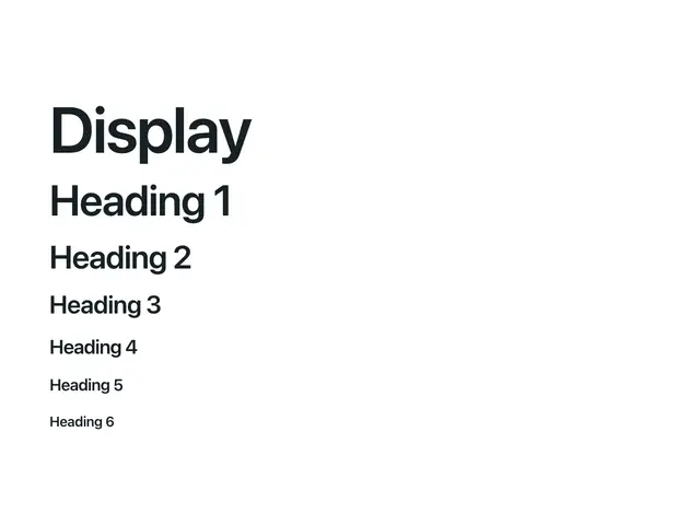
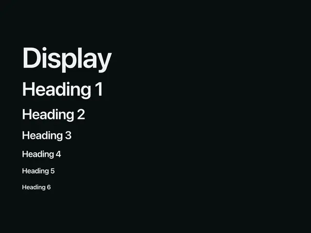
TypographyThe fluid type scale, the font stack, Heading/Text/Prose, and tabular numbers for aligned digits.
Spacing & layoutFluid page/section spacing vs. Tailwind's fixed scale for component internals, plus the layout primitives.

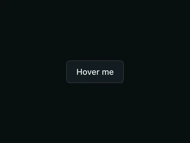
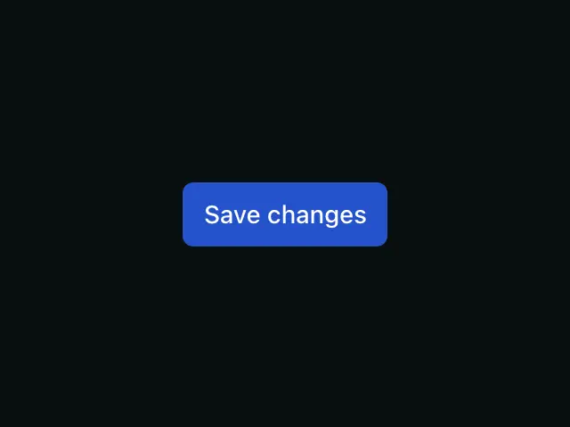
MotionFour durations, three easings, wired as Tailwind's defaults, and the mandatory reduced-motion guard.

AccessibilityThe accessibility commitments every Apogee component ships with, and how to verify them.


RTL & internationalizationHow Apogee components mirror automatically under a right-to-left ancestor, using logical CSS properties.
Content & voiceThe writing rules for text inside components — buttons, labels, errors, empty states, and tone.
UtilitiesThe shared helpers every component builds on, and how to use them in your own code.
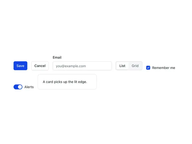
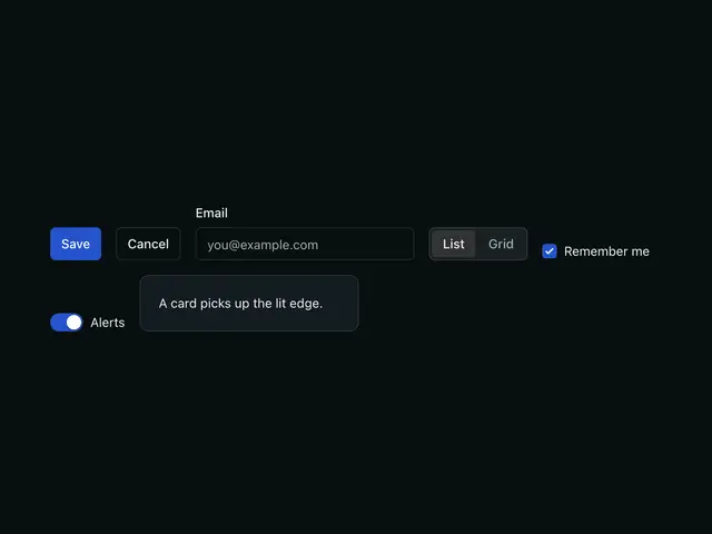
SkinsAn optional look you switch on with one attribute, built from three variables the components already read.
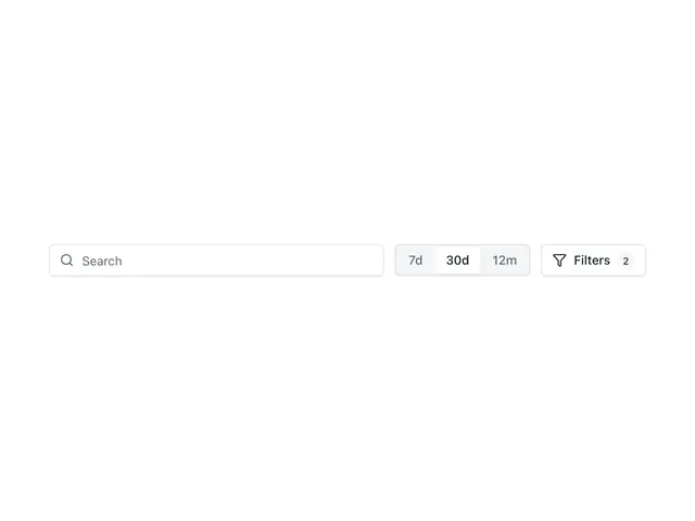
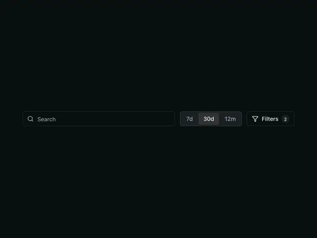
PatternsApplication recipes built from existing components — filter bars, inline calls to action, and an index of every recipe on the component pages.