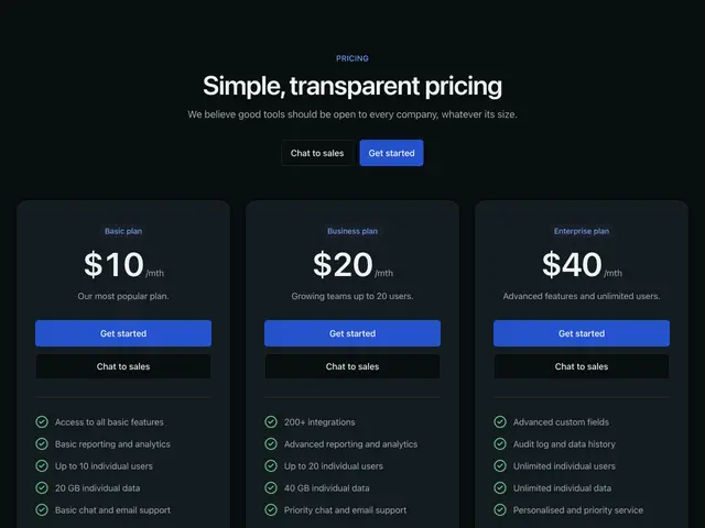
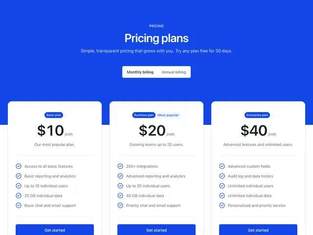
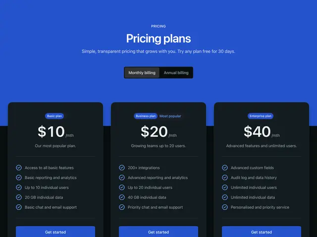
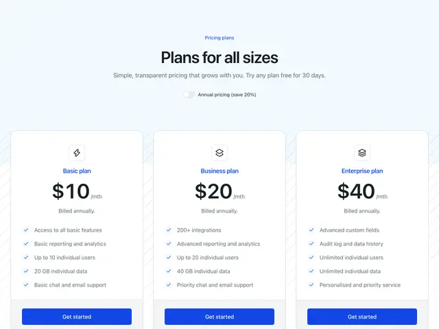
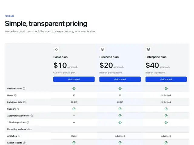
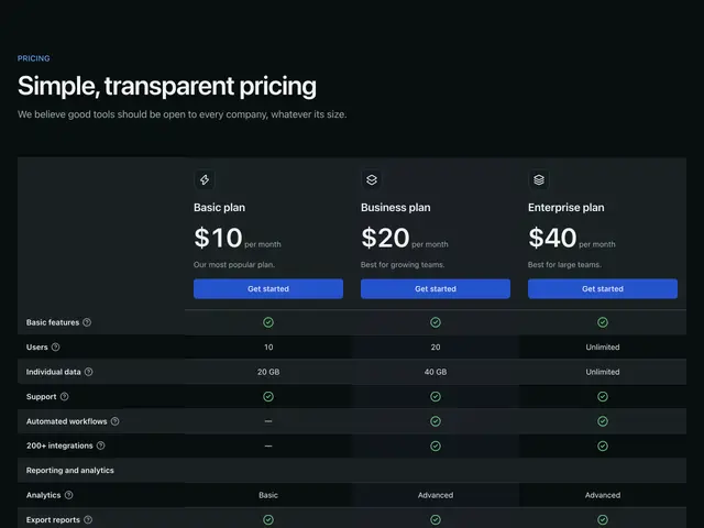
Plan cards in many styles, billing switches and full comparison tables with grouped features and tooltips.

Last updated

Each example is a block: a Section with a SectionHeader and plan cards built from Heading, Button, Badge and FeaturedIcon, or a comparison Table.

  • Billing switch. Both prices are in the page. The switch is a SegmentedControl (or a Switch), and a CSS :has() rule on the wrapper shows the annual prices while “annual” is checked. No JS.
  • Comparison tables show one table on wide screens and a stacked table per plan on phones. Each feature name has a Tooltip with a short explanation.
npx @ava-ui/apogee add pricing/simple-cards-01

Copy is props

Every block in this family takes the same content props (PricingContent in sections/_shared/pricing.ts), with its sample copy as the defaults. A block ignores the props it has no place for, so you can swap one block for another and keep the copy. The Pricing section takes the same names for the props they share.

  • eyebrow: The small label above the heading.

  • heading: The heading.

  • description: The line under the heading.

  • label: Landmark name when there is no heading.

  • periodLabel: Name of the billing switch.

  • periods: Labels for the billing switch.

  • items: Plans.

  • Pass null to hide an optional part, such as description={null}.

  • Some blocks add props of their own; the top of each block’s file lists them.
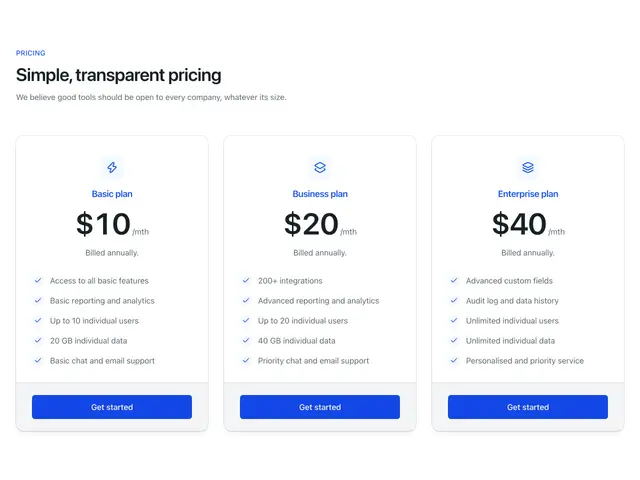
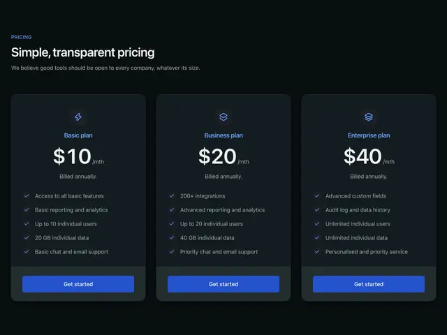
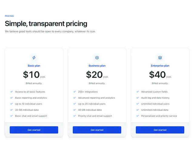
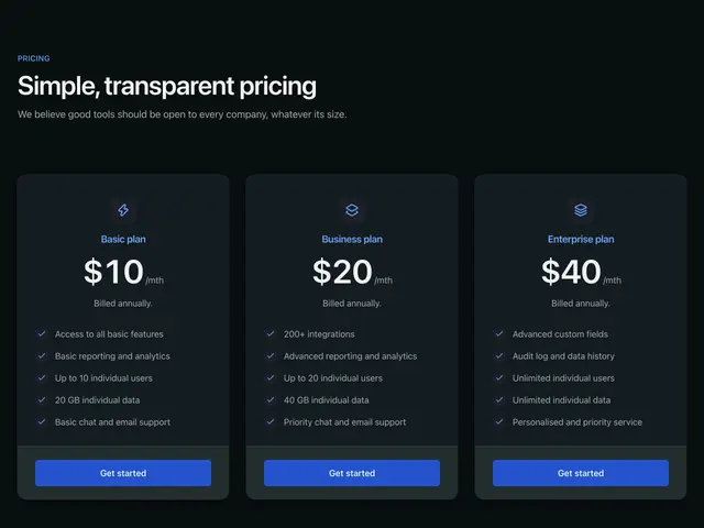
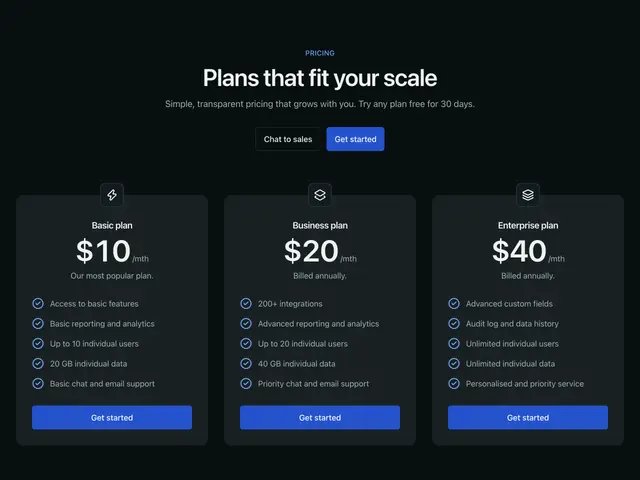
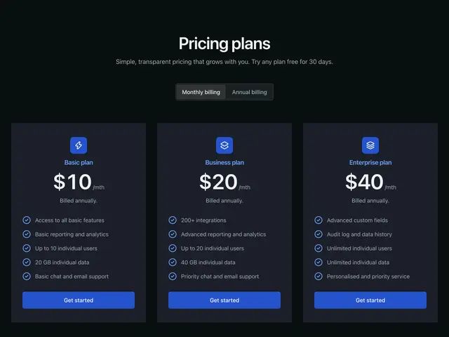
Simple cards 01A heading over three plan cards, each with an icon, contained checks and a footer button.
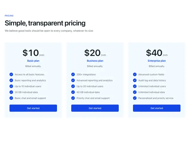
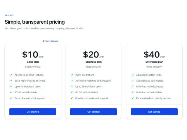
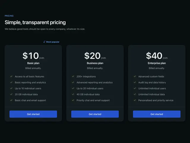
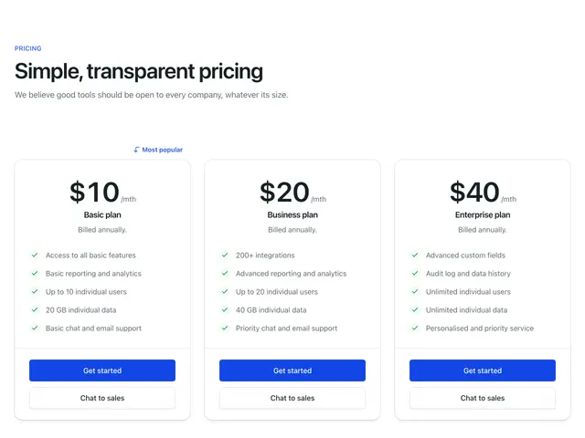
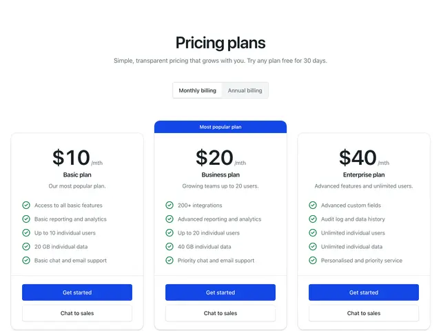
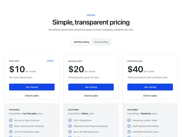
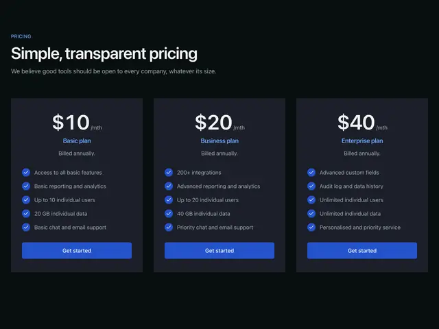
Simple cards 02A heading over three plan cards, the first marked most popular.
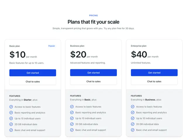
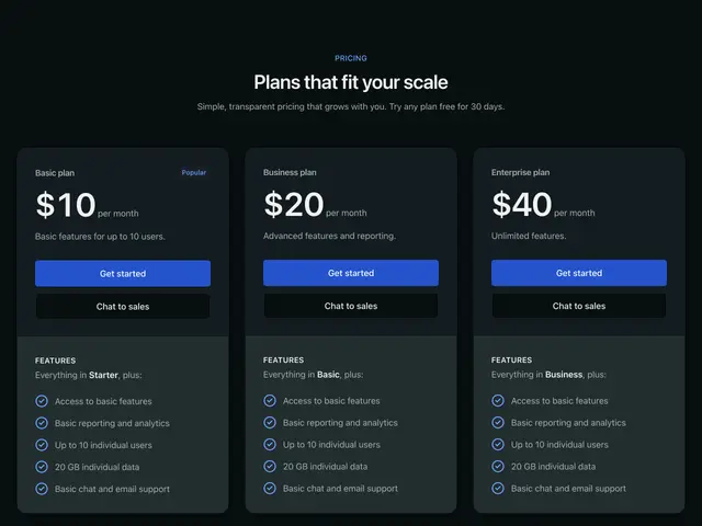
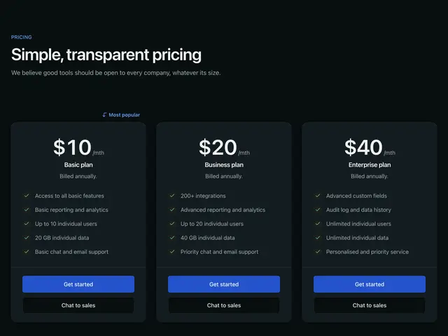
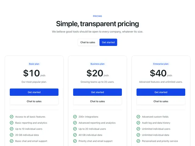
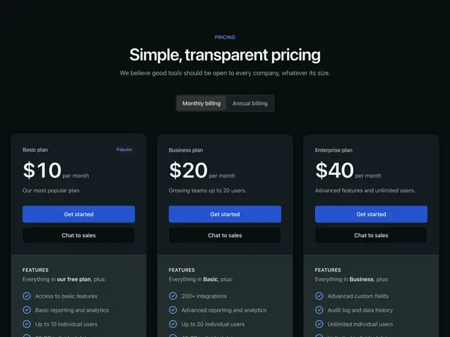
Simple cards 03A centred heading over three plan cards with two actions and a features panel.
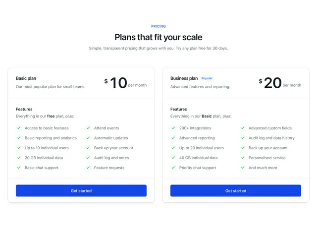
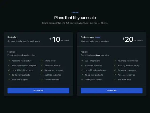
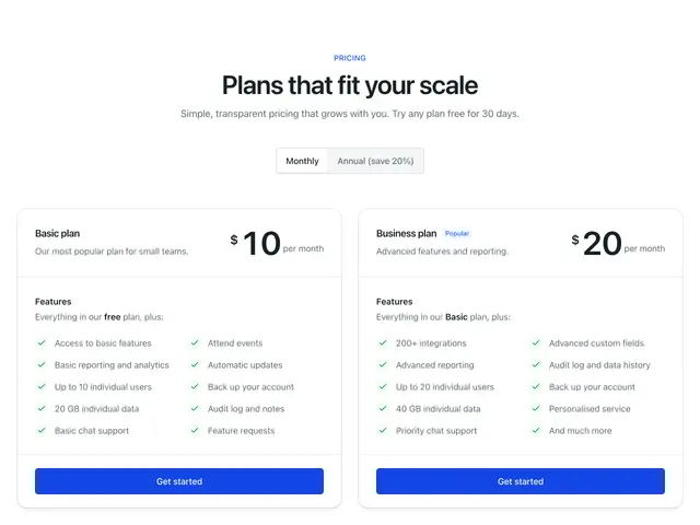
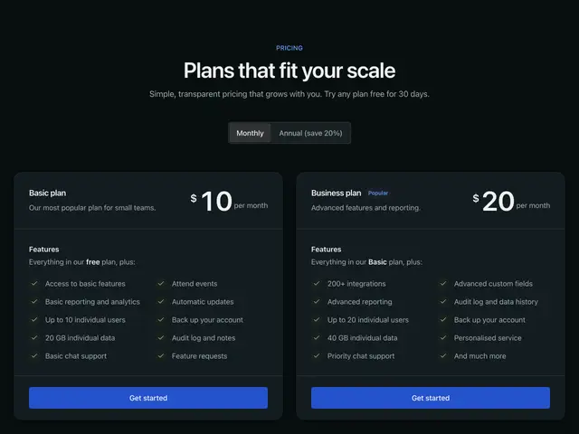
Simple cards 04A centred heading over two wide plan cards with features in two columns.
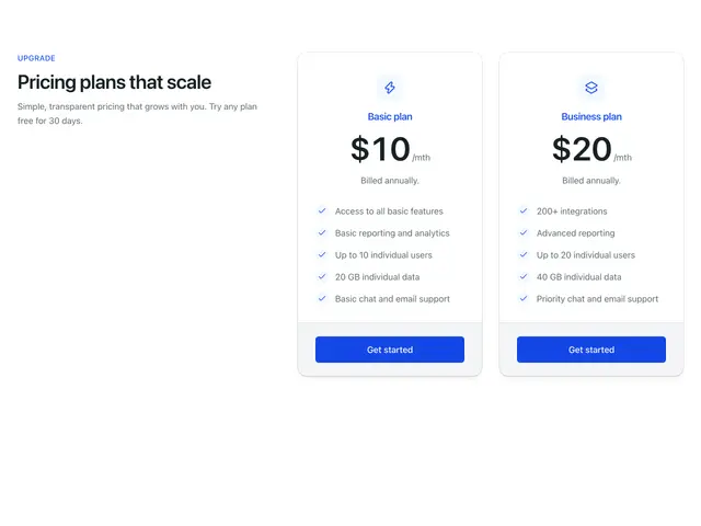
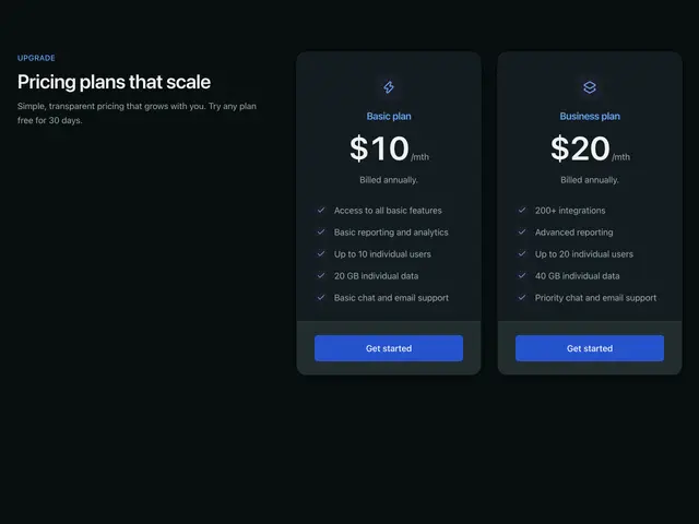
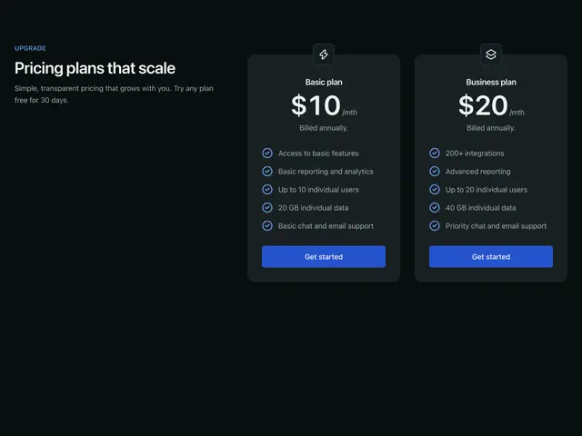
Featured cards 01A heading beside two plan cards with icons.
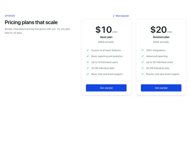
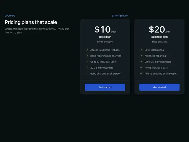
Featured cards 02A heading beside two plan cards, the first marked most popular.
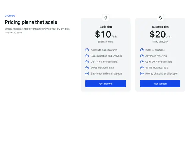
Featured cards 03A heading beside two grey plan cards with icons on their top edge.
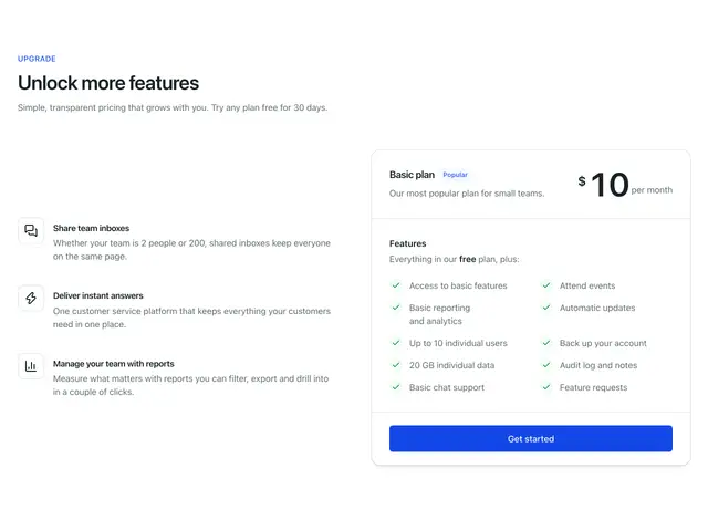
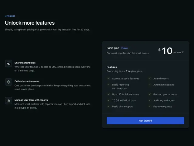
Featured cards 04A heading and three feature rows beside one wide plan card.
Simple iconA large heading over three plan cards with icons.
Simple call outA large heading over three plan cards with two actions each, the first marked most popular.
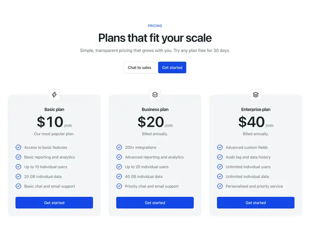
Simple icon offsetA centred heading with actions over three grey plan cards with icons on their top edge.
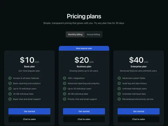
Simple bannerA centred heading and billing switch over three plan cards, the middle one with a banner.
Simple dual check itemA centred heading and billing switch over two wide plan cards with features in two columns.
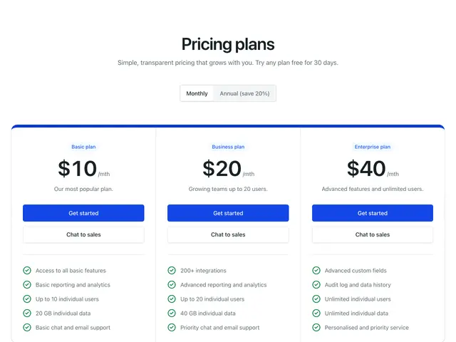
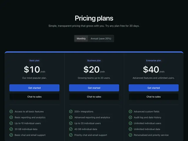
Simple accent lineA centred heading and billing switch over three plans joined into one panel with a brand top edge.
Gray badgeA centred heading with actions over three plan cards with badges.
Primary dark badgeA heading and billing switch on a brand band, with three plan cards overlapping it.
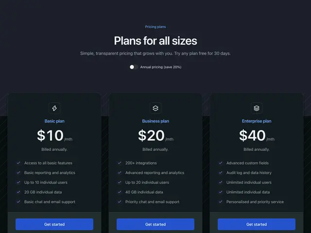
Abstract anglesA heading and annual switch on a tinted band over three plan cards on a striped ground.
Dual actionA centred heading and billing switch over three plan cards with two actions and a features panel.
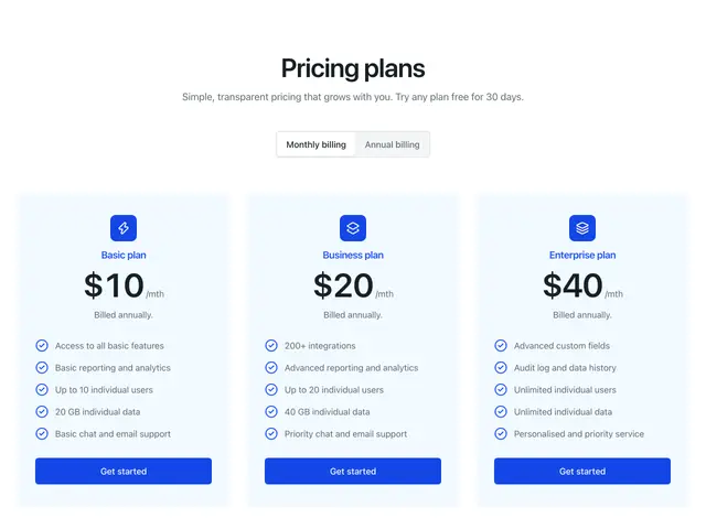
Primary card iconA centred heading and billing switch over three tinted plan panels with icons.
Primary card simpleA heading over three tinted plan panels with filled checks.
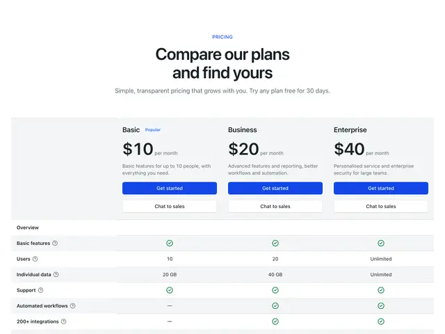
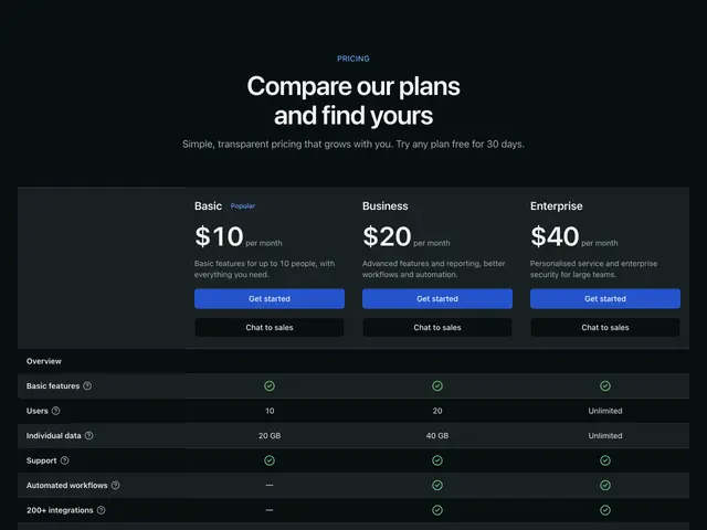
Large table 01A centred heading over a plan comparison table with grouped features and tooltips.
Large table 02A heading over a plan comparison table with plan icons and the middle plan highlighted.