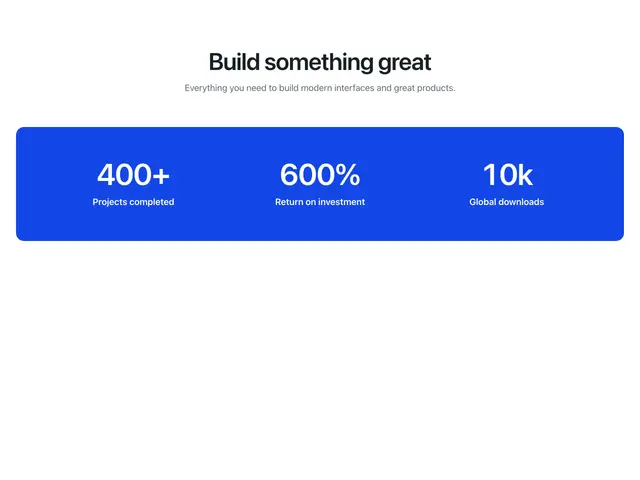
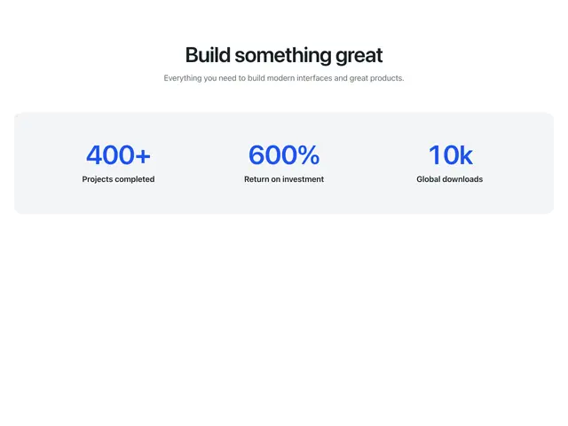
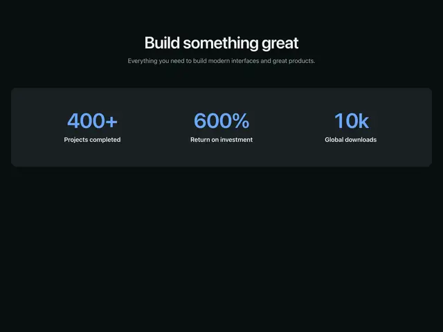
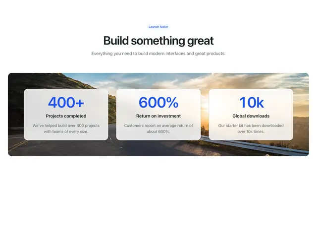
Metrics sections
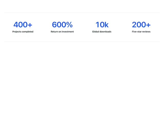
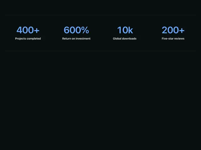
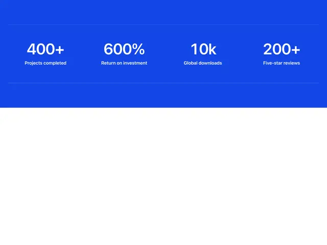
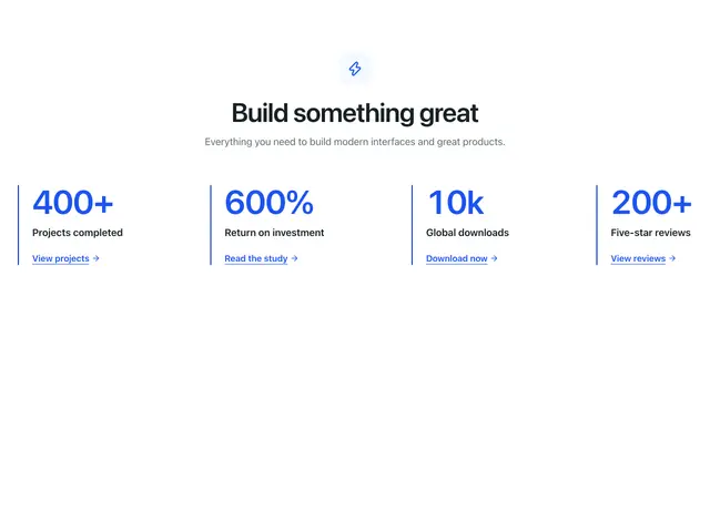
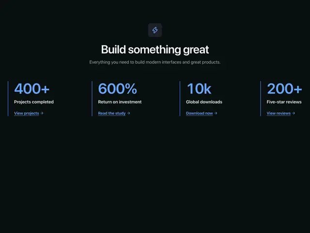
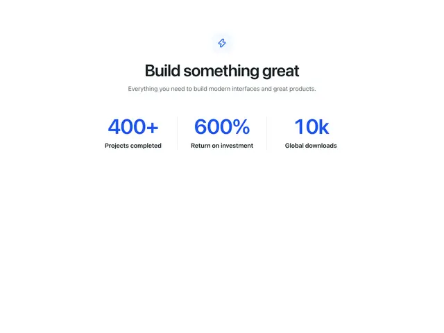
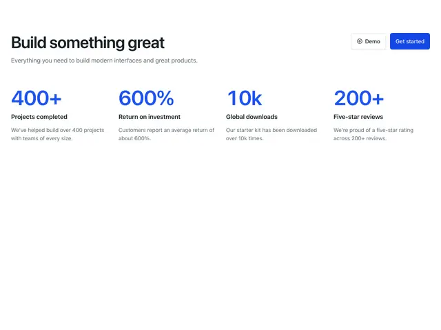
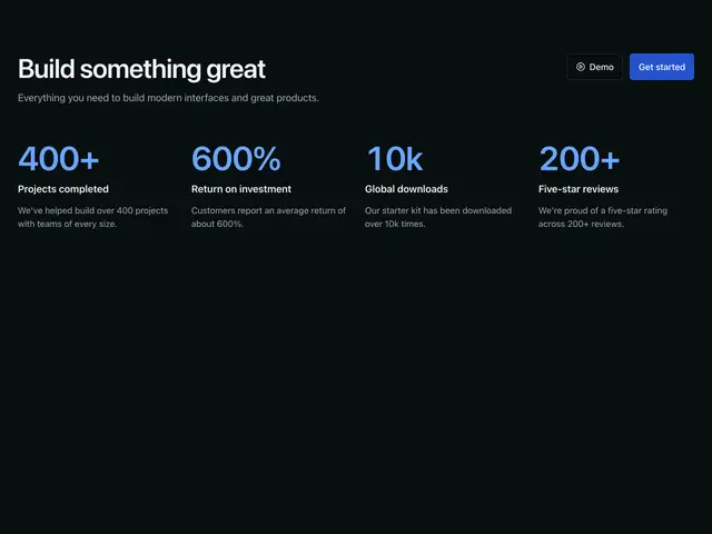
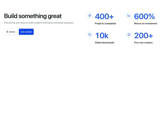
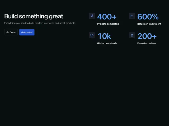
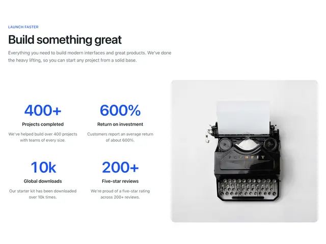
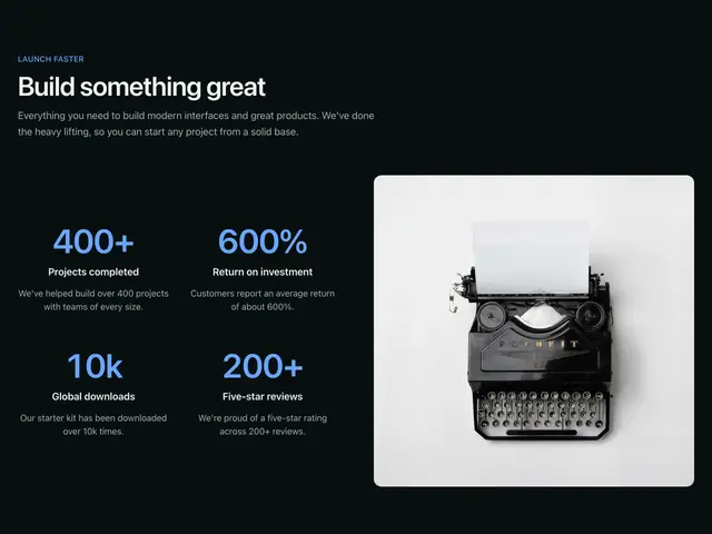
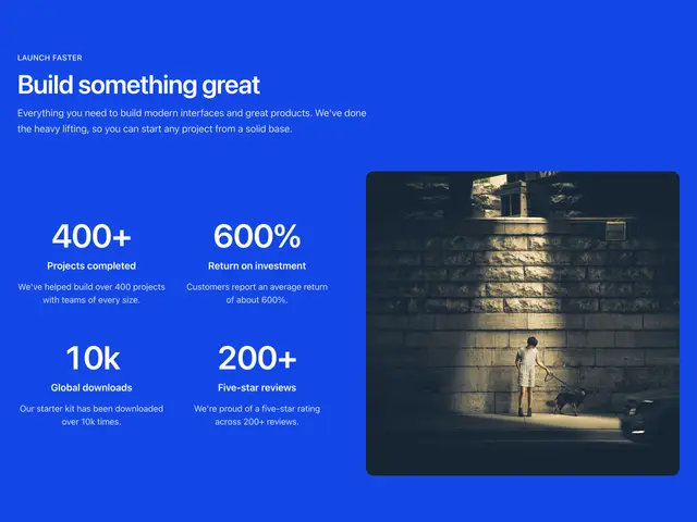
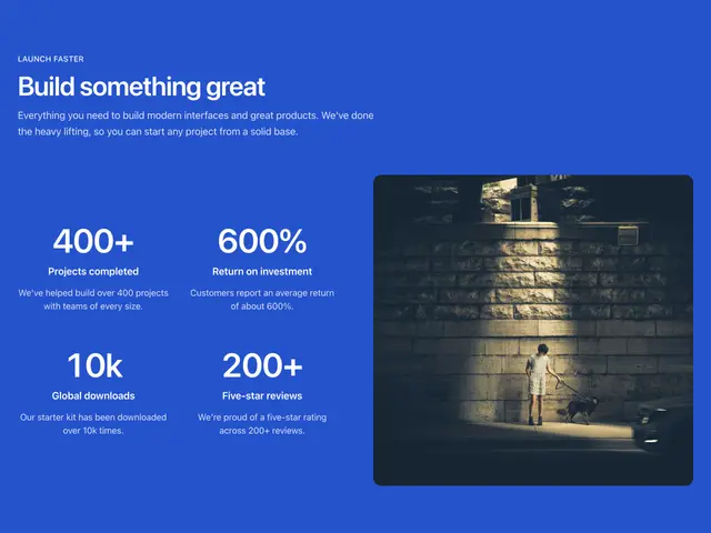
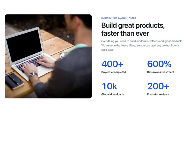
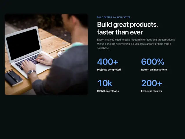
Headline figures in a row, a card, on a photo or beside an image, with dividers, accent lines, icons or links.
Last updated
Each example is a block: a Section with a SectionHeader and a description list of figures. Each figure is a term (the label) and its value, so screen readers read them as pairs.
npx @ava-ui/apogee add metrics/simple-centered-textCopy is props
Every block in this family takes the same content props (MetricsContent in
sections/_shared/metrics.ts), with its sample copy as the defaults. A block
ignores the props it has no place for, so you can swap one block for another and
keep the copy. The Stats section takes the same names for the props they share.
-
eyebrow: The small label above the heading. -
heading: The heading. -
description: The line under the heading. -
label: Landmark name when the block shows no heading. -
items: The figures. Blocks without room for a line ignoredescription. -
primaryAction: The solid button. -
secondaryAction: The outline button. -
media: The photo behind or beside the figures. -
Pass
nullto hide an optional part, such asdescription={null}. -
Some blocks add props of their own; the top of each block’s file lists them.