Landing pages
Whole landing pages: a hero, customer logos, features, quotes, pricing and calls to action, between a header and a footer.
Last updated
Each example is a whole product landing page stacked from blocks: a header navigation in the hero’s colour, a hero from Hero sections that holds the page’s h1, then customer logos, features, quotes, pricing, questions and calls to action, alternating between the page colour, grey bands, the brand colour and a dark footer. Adding a page copies its blocks too. The page renders its own header, <main> and footer, so give it a layout without a <main>.
npx @ava-ui/apogee add landing/landing-page-01---
// src/pages/landing.astro
import Layout from '../layouts/Layout.astro'
import Page from '../components/apogee/pages/landing/LandingPage01.astro'
---
<Layout title="Landing">
<Page />
</Layout>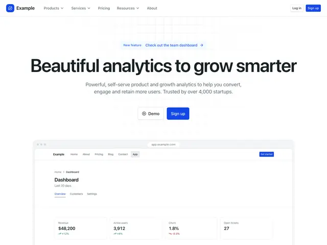
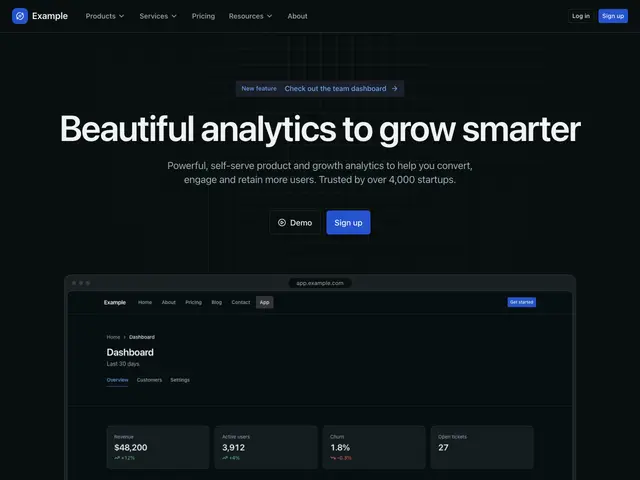
Landing page 01A centred heading and two buttons over a phone on small screens and a browser on wide ones, over a grid. Then customer logos, features with icons, customer quotes on grey, questions in an accordion, customer quotes, more posts and a footer.
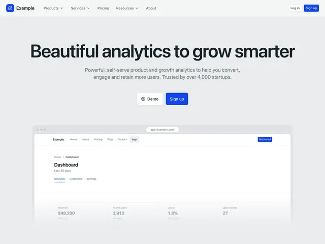
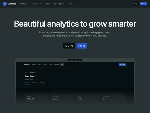
Landing page 02A centred heading and two buttons over a cropped screenshot, on a tint with a dot grid on grey. Then customer logos, alternating feature rows, integrations on grey, figures, a call to action card, customer quotes, a call to action with a screenshot and a footer on dark.
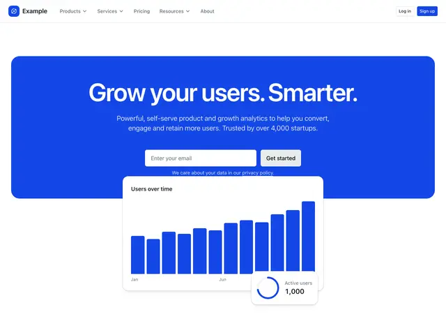
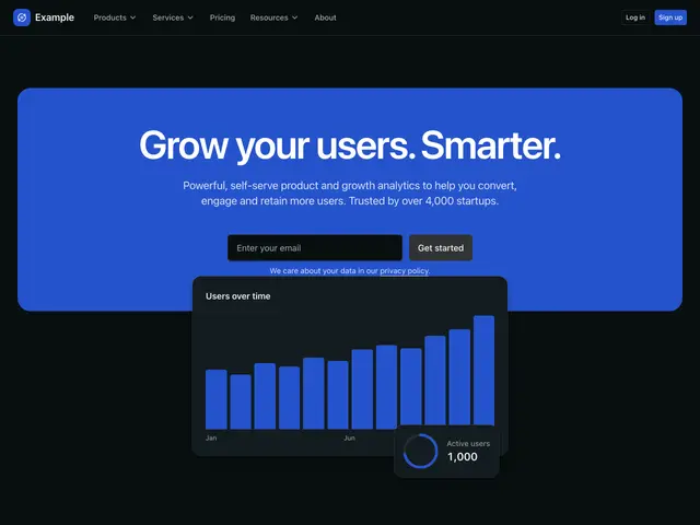
Landing page 03A centred heading and email signup on a brand card, over a chart. Then integrations, figures, features under a screenshot, pricing plans, questions in an accordion, customer logos and a footer.
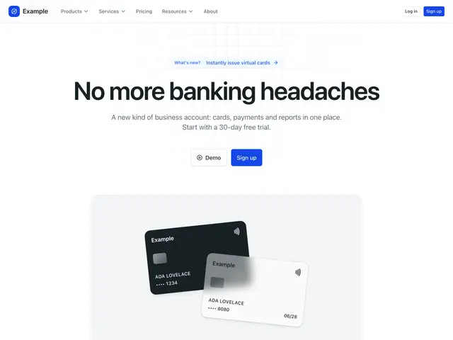
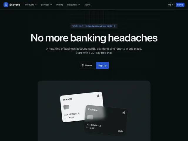
Landing page 04A centred heading and two buttons over two payment cards on a panel, over a fine grid. Then customer logos, features with icons on grey, pricing plans, customer quotes, a call to action with a screenshot and a footer.
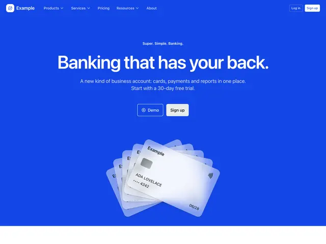
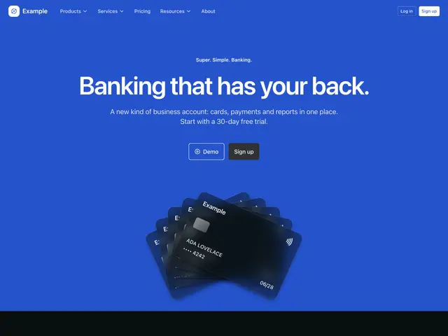
Landing page 05A centred eyebrow, heading and two buttons over five fanned payment cards, on the brand colour. Then customer logos, features with icons, a call to action with a photo, feature tabs, pricing plans on grey, customer quotes on the brand colour and a footer on the brand colour.
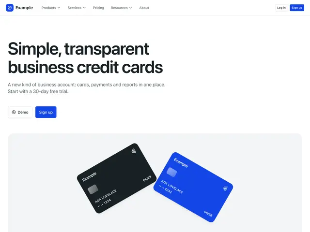
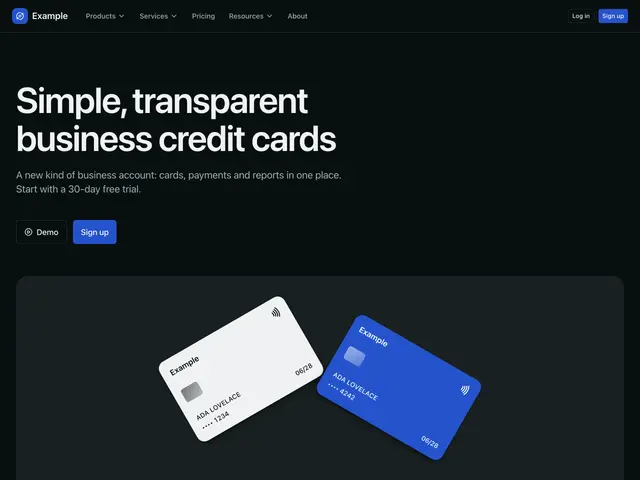
Landing page 06A heading and two buttons over a wide panel of tilted payment cards. Then customer logos, feature tabs, a large screenshot, a call to action on grey, pricing plans, a call to action card on the brand colour and a footer.
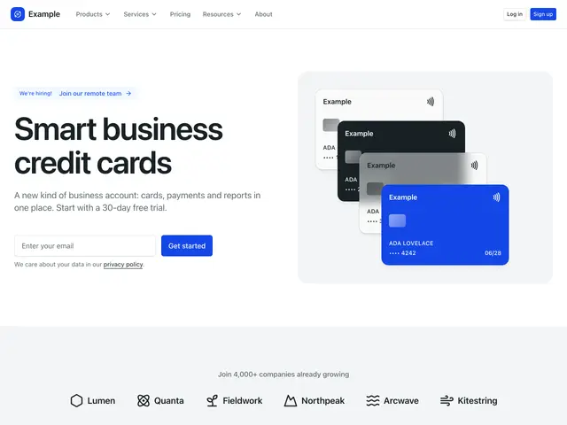
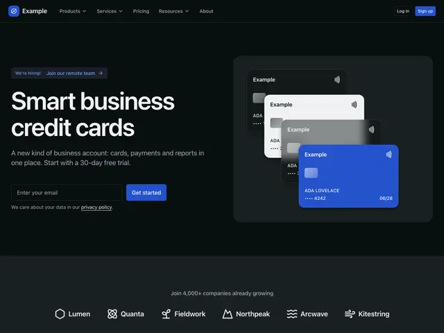
Landing page 07A heading and email signup beside a cascade of payment cards on a panel. Then customer logos on grey, features beside a mockup, a call to action with images on grey, feature cards, pricing plans on grey, a newsletter signup, a call to action card on the brand colour and a footer on dark.
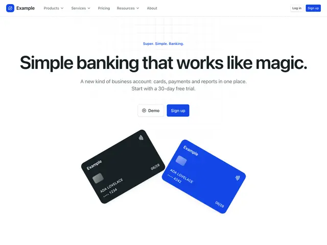
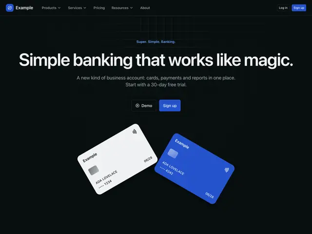
Landing page 08A centred eyebrow, heading and two buttons over two tilted payment cards, over a fine grid. Then features beside a mockup, pricing plans, features with icons on grey, feature tabs, integrations, customer logos, a call to action card on the brand colour and a footer on grey.
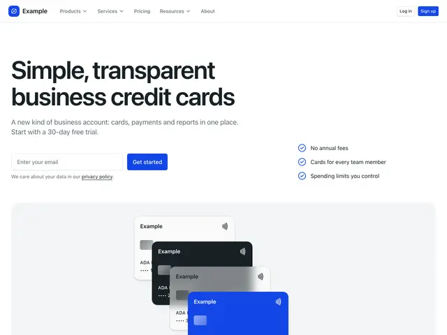
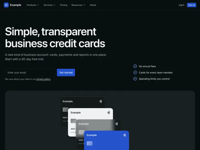
Landing page 09A heading, email signup and three points over a wide panel of payment cards, over a dot grid. Then customer logos, a large screenshot, customer quotes, a call to action card, feature tabs, pricing plans on grey, a newsletter signup on the brand colour and a footer.
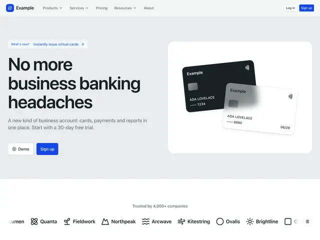
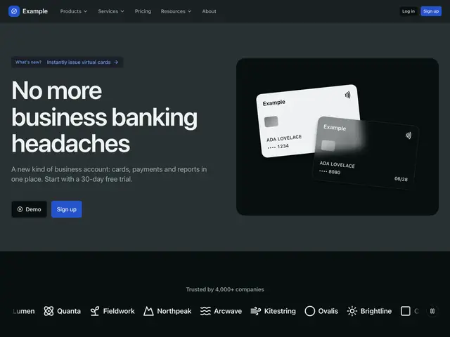
Landing page 10A heading and two buttons beside two payment cards on a panel, on a tint with a dot grid on grey. Then customer logos, customer quotes, feature tabs, press mentions, more posts on grey, a call to action with customer logos, a newsletter signup on grey and a footer on dark.
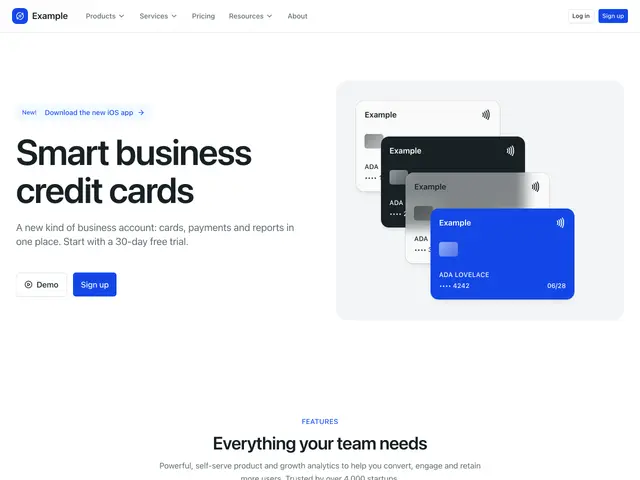
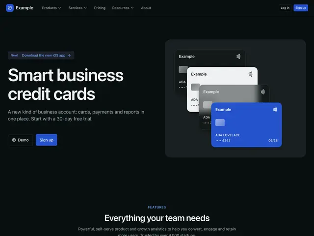
Landing page 11A heading and two buttons beside four payment cards on a panel. Then features with icons, pricing plans, customer quotes, customer logos, a call to action with a screenshot and a footer on dark.
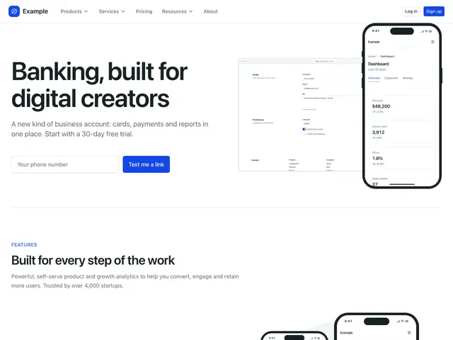
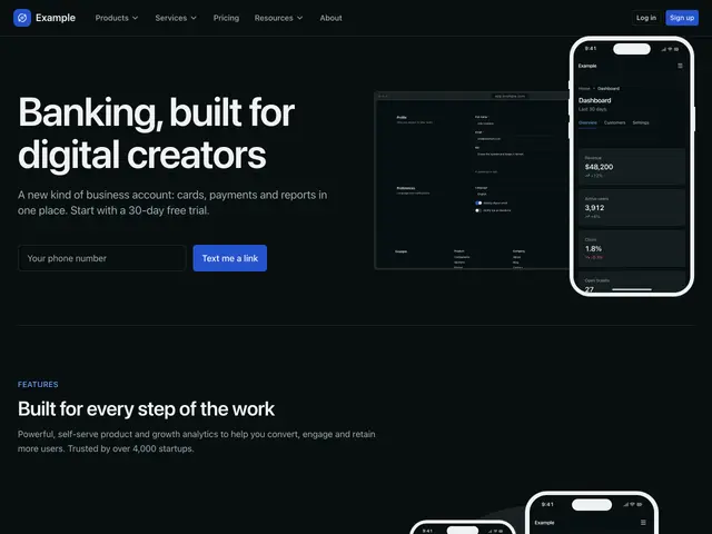
Landing page 12A heading, line and a text-me-a-link form beside a phone over a screenshot, over a dot grid. Then feature tabs, a call to action card, questions in an accordion, an app download call to action, a newsletter signup on grey and a footer.
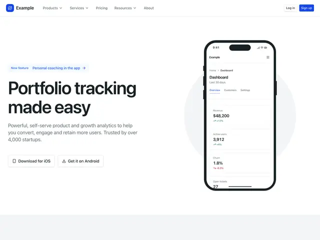
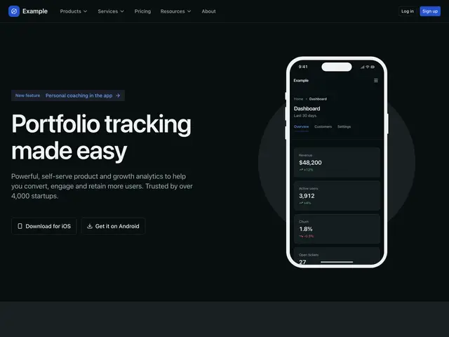
Landing page 13A heading, line and app buttons beside a phone, over a dot grid. Then customer logos on grey, features beside a mockup, an app download call to action, pricing plans, a newsletter signup and a footer on the brand colour.
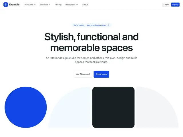
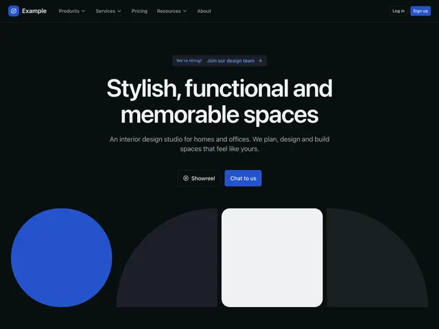
Landing page 14A centred heading, line and two buttons over a wide row of geometric shapes, over a dot grid. Then customer logos, a content section, customer quotes, figures, ways to get in touch, a newsletter signup and a footer on dark.
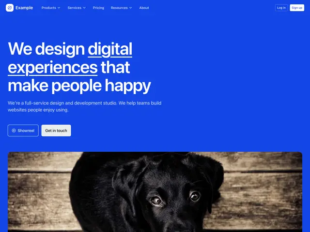
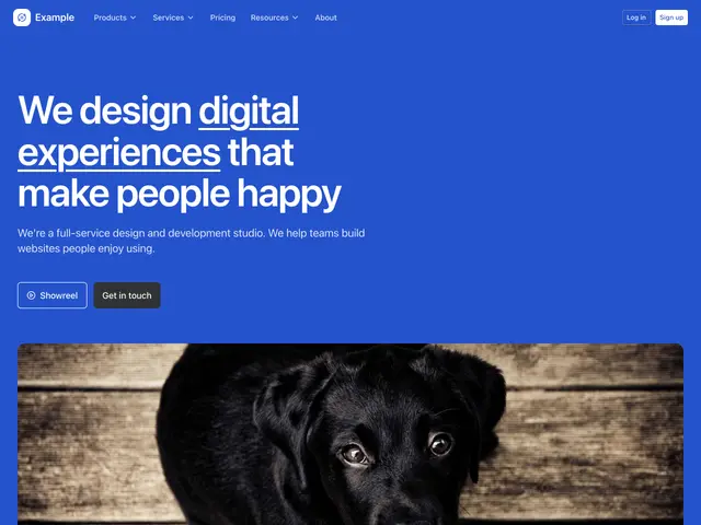
Landing page 15A large heading with an underlined phrase, a line and two buttons over a wide photo, on the brand colour. Then customer logos on the brand colour, features beside a photo, customer quotes on grey, figures, a contact form and a footer.
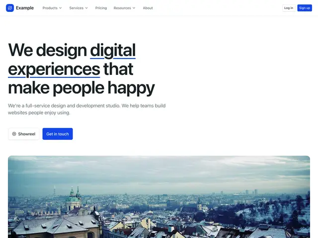
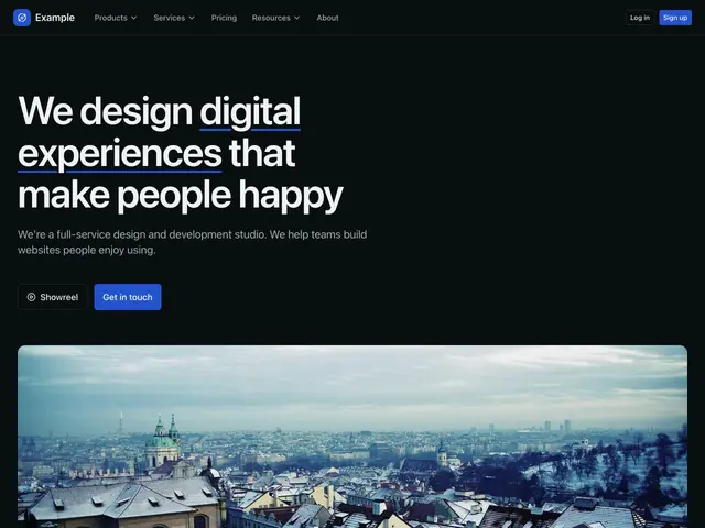
Landing page 16A large heading with an underlined phrase, a line and two buttons over a wide photo, over a dot grid. Then customer logos, feature tabs, customer quotes, features with icons, contact cards, a newsletter signup on grey and a footer.
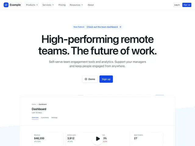
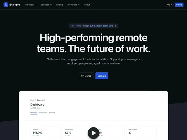
Landing page 17A centred heading and two buttons over a video on a slanted band. Then customer logos, feature tabs, customer quotes, a call to action with a screenshot, more posts, a call to action with customer logos and a footer on dark.
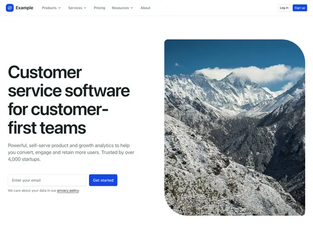
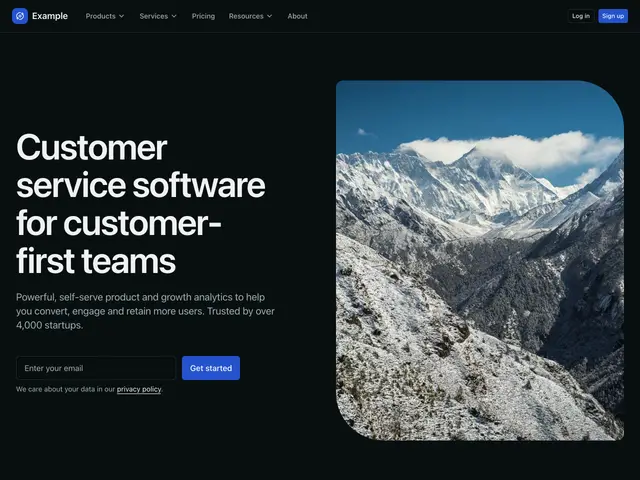
Landing page 18A heading, line and email signup beside a portrait photo, over a dot grid. Then alternating feature rows, a call to action card, feature tabs, customer quotes, a call to action with a screenshot, a newsletter signup on grey and a footer on dark.
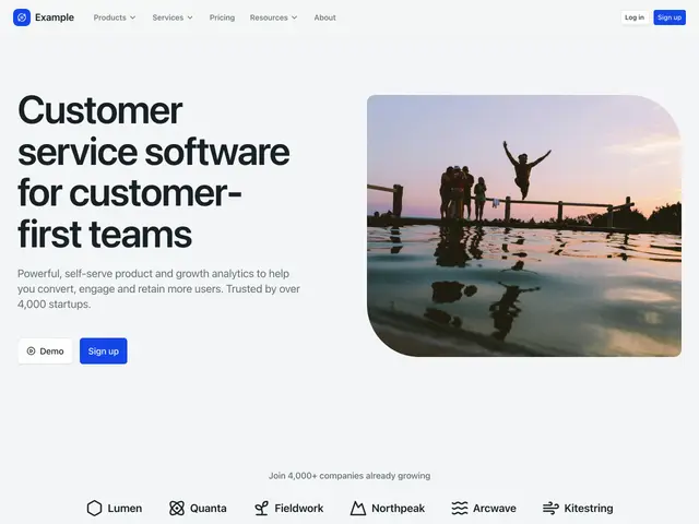
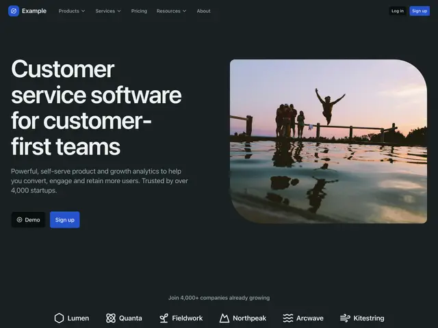
Landing page 19A heading, line and two buttons beside a workspace photo, over a dot grid on grey. Then customer logos on grey, integrations, a large screenshot, figures, a call to action card, customer quotes on grey, a call to action with a screenshot, a newsletter signup on grey and a footer on grey.
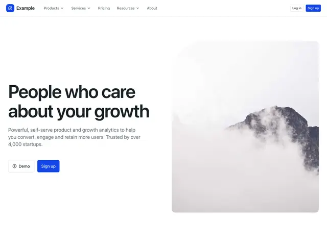
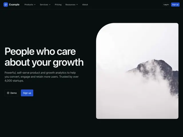
Landing page 20A heading, line and two buttons beside a photo with one large rounded corner. Then customer logos, feature tabs, figures, a call to action on grey, pricing plans, customer quotes, a call to action with images and a footer.